analysed on 26 October 2026
What the Site Is AboutAdam Hills Photography is a London portrait photography business specialising in actor headshots, corporate portraits and images for creatives, dancers, models and entrepreneurs. The photographer, Adam, is based in Greenwich, South East London, and says he has worked professionally in headshot photography since 2010.The site’s purpose is to help prospective clients understand Adam’s approach, view examples of his work, and enquire about or book a photo session. It also promotes a 2026 membership offering, which starts at £30 per month and includes multiple shoots and access to high-resolution images. Members can also book showreel monologues and self-tape sessions with professional lighting and audio. Good Points and Trust Signals - Clear identity and location: The photographer gives his name, business name and Greenwich studio address: 11 Westerdale Road, Greenwich, SE10 0LW.
- Direct contact details: An email address and UK phone number are provided, alongside options to enquire through WhatsApp or a contact form.
- Relevant experience: Adam states that he has been a full-time headshot photographer since 2010 and has worked with thousands of clients. He also describes his previous experience as a performer, which is particularly relevant to actor portraits.
- Specific facilities: The site describes a 500-square-foot Greenwich studio with multiple backgrounds, lighting setups and equipment.
- Social proof: Several testimonials describe positive experiences, including comments from clients and industry professionals. Named references include Kerry Ellis, Dr Oscar Duke and David Learner, with role or professional context supplied for some.
- Professional affiliations: Adam says he is a founding member of the APHP, an organisation that accredits members, and an associate member of a headshot photography community. The site also notes that his Photo Workflow system is used by more than 40 industry professionals.
- Helpful preparation and booking options: Visitors are encouraged to explore portfolios, preparation guidance and packages, and can book a session or ask questions directly.
- Personalised service: The description explains how sessions are tailored to each person, with posing guidance, lighting choices and a relaxed, collaborative approach.
Improvements to Help Visitors - Make pricing easier to assess: Provide a concise comparison of standard packages, including session length, number of looks, image selection and any retouching or download fees. For membership, explain the minimum commitment, cancellation terms, booking limits and exactly what “free access to all the images” includes.
- Explain the full process: Set out what happens before, during and after a shoot, including how clients select images, expected delivery times, retouching options and image-use or licensing terms.
- Clarify service details: State whether the studio is suitable for corporate teams or group bookings, and provide practical information such as payment methods and rescheduling or cancellation policies.
- Proofread and standardise the copy: There are visible spelling, grammar and punctuation errors, as well as inconsistent wording. Correcting these would make service details clearer and strengthen the professional impression.
- Make enquiries more actionable: Explain what information to include when contacting Adam and give a realistic response timeframe, so prospective clients know what to expect.
analysed on 25 October 2026
What the Site Is AboutDimensional Architects presents itself as a Mumbai-based architecture, interior design, and turnkey fit-out provider. Its services cover corporate offices, hospitality, retail and commercial spaces, serviced apartments, and technical execution. The site also promotes serviced and co-working offices at DA Business Center in Bandra Kurla Complex (BKC), including private cabins, meeting rooms, and virtual office services.The main purpose is to attract businesses and other clients seeking workspace design, construction, or managed office accommodation. The company emphasizes end-to-end project delivery—from planning and design to construction, management, and handover—and positions its services as premium yet adaptable to different budgets. Good Points and Trust Signals - Clear contact details: The site lists a Mumbai business address in Pinnacle Corporate Park, BKC, along with a phone number, email address, and business hours. Sunday appointments are also mentioned.
- Specific service information: Visitors can see the types of projects and technical work offered, including MEP, HVAC, carpentry, IT infrastructure, automation, and project management.
- Useful pricing details: The FAQ gives starting prices for serviced office seats, virtual offices, and meeting and conference room bookings, and explains what certain office packages include.
- Experience and scale claims: The company cites more than 200 projects, work across 40-plus cities, 20 million square feet delivered, and a team of 250-plus experts. These figures communicate a substantial claimed track record.
- Process and accountability: The site describes dedicated project planning, tailored scopes of work, milestone timelines, quality checks, project tracking, and itemized pricing. It also says clients receive invoices and digital payment receipts.
- Client feedback and brand references: Testimonials mention organizations including ICICI HFC, Flyidus, and Headways, and the page refers to work for leading brands.
- Operational assurances: Serviced-office information mentions reception, mail handling, housekeeping, security, Wi-Fi, and power backup. The site also describes support during projects and a quality assurance process.
Improvements to Help Visitors - Resolve conflicting figures: The page variously refers to 200-plus projects, 250-plus projects, “over a decade” of expertise, and 25-plus years of combined expertise. Clarify what each number measures and use consistent figures throughout.
- Substantiate major claims: Support statements such as “India’s No. 1,” “award-winning,” and “most trusted” with named awards, independent rankings, or other verifiable evidence.
- Strengthen testimonials: Correct the visibly corrupted testimonial text and provide each reviewer’s full organization name, role, project type, and permission-based attribution. Add links to detailed case studies where possible.
- Clarify pricing and terms: Confirm whether listed rates are current, explain taxes and eligibility, and specify what is included or excluded. The displayed currency symbols and some FAQ text appear garbled.
- Proofread and repair encoding: Numerous words contain broken characters, spelling errors, duplicated labels, and malformed symbols. Correcting these would make the information easier to understand and more credible.
- Make service details more concrete: Add project examples, timelines, deliverables, service areas, and warranty or post-handover terms so prospective clients can judge suitability before contacting the company.
analysed on 24 October 2026
What the Site Is AboutPop Canada sells customisable promotional displays for businesses, including exhibition booths, tension-fabric displays, banner stands, counters, cardboard retail displays and other trade-show and point-of-purchase products. Visitors can browse product categories and add some items to a shopping cart, while custom requirements can be discussed with the company.The site also promotes website design, hosting, maintenance, IT and search-engine optimisation services through Pop Group Digital. Its broader purpose is to help businesses promote their brands, both in physical retail and event settings and online. Good Points and Trust Signals - Clear contact details: The site lists a Vancouver, BC address, an email address and a WhatsApp/phone number. It also states that it is open seven days a week.
- Customer testimonials: Numerous reviews name clients and their locations, including businesses in Canada, Australia, Ireland, New Zealand, Brazil, Germany and the USA. Several describe specific projects and praise communication, reliability and finished work.
- Reported customer outcomes: Some testimonials say website work improved sales, brand awareness or online presence. These are customer-reported experiences rather than independently verified results.
- Experience claims: Pop Canada says it has helped businesses promote their brands for over ten years and describes itself as part of Pop Group.
- Product breadth: The site lists many display types and shows new product releases, giving visitors a sense of the range available.
- Customer-service information: Shipping, warranty, returns, privacy and artwork-guideline information are listed, which can help customers understand policies before ordering.
- Ways to enquire: Visitors are invited to request free advice, discuss custom displays and submit a product quotation enquiry.
Improvements to Help Visitors - Clarify contact information: The listed address is in Vancouver, while the phone number uses Australia’s country code. Explain which office or team handles enquiries, provide the relevant local contact numbers, and add a complete postal address and business identification details.
- Explain purchasing and quoting: State which products have fixed prices and which require a quote. For quote requests, outline expected response times and the information customers should provide, such as dimensions, quantity, artwork and delivery destination.
- Add practical product details: Include dimensions, materials, weights, included components, print options, setup instructions, portability details and customization limits. This would help buyers compare products and judge suitability before contacting the team.
- Make delivery expectations clearer: Explain shipping regions, costs, production times, delivery estimates, tracking and any import duties. This is especially useful for an apparent international customer base.
- Refresh dated news: Several event posts refer to 2023 and 2024. Update these with current events or clearly label older items as archived so visitors can distinguish current information from past announcements.
- Strengthen service evidence: Add detailed case studies with project requirements, process, product specifications and measurable outcomes where clients have agreed to share them.
- Clarify promotions and email sign-up: State how visitors receive the discount code, its expiry date and any exclusions. Correct the apparent “emais” typo in the sign-up terms and make email consent and privacy details easy to understand.
analysed on 23 October 2026
What the Site Is AboutAH Interiors is an Irish home interiors retailer and interior design service. Its website lets customers browse and buy furniture, carpets, flooring, rugs, lighting and home accessories, including bespoke and made-to-measure items. It also promotes services such as interior consultations, fitting and measuring, made-to-measure curtains, and nationwide delivery. The business aims to help customers furnish and personalise their homes, with online shopping complemented by an in-person showroom in Finglas, Dublin.Good Points and Trust Signals - Clear business details: The site provides a physical address at McKee Avenue, Finglas, Dublin 11, a phone number, email address and opening hours. It also gives directions to the store.
- Established local presence: AH Interiors describes itself as a family-run business located in Finglas since 2013, which helps visitors understand its background and longevity.
- Customer testimonials: Several named customers praise the team’s helpful advice, professionalism, product quality, delivery and carpet-fitting service. These first-hand accounts offer useful reassurance.
- Practical service options: The site mentions click and collect, nationwide delivery and a quick, free measuring service, with a phone number for enquiries.
- Policies and support information: Visitors can find FAQ, contact, returns or refunds, shipping and delivery, privacy and security, cookie and terms information.
- Payment choice: The site lists major card and digital payment options, including American Express, Apple Pay, Google Pay, Mastercard and Klarna.
- Useful product information: Many featured products display prices, while some sofas are identified as made to measure. Gift cards are offered in several denominations.
- Inspiration and advice: The magazine includes articles about sofas and flooring, and the site promotes personalised interior design consultations.
Improvements to Help Visitors - Explain services in more detail: Add clear descriptions of what an interior consultation includes, how to book, whether fees apply, and what customers should prepare. For measuring, fitting and delivery, explain service areas, scheduling, costs and typical timeframes.
- Make product details more complete: Where relevant, provide dimensions, materials, colour choices, care instructions, stock status, delivery estimates and bespoke lead times. This would help visitors compare options and make informed decisions before contacting the store.
- Clarify returns and made-to-measure terms: Summarise key return conditions, exclusions for customised products, cancellation rules and how to report damaged or faulty orders, with links to the full policies.
- Improve product-page accuracy: Some displayed text appears inconsistent or corrupted, including malformed euro prices and gift-card variants, and a “Save 0%” label. Review prices, variant labels, spelling and product descriptions so shoppers can trust the information.
- Strengthen review context: Consider adding review dates and identifying the service or product each testimonial relates to, while preserving customers’ privacy and consent.
- Set expectations for online orders: State how customers can get help with availability, bespoke orders and post-purchase issues, and provide expected response times.
analysed on 22 October 2026
What the Site Is AboutApex Infotech India presents itself as a Mumbai-based digital marketing and technology agency helping businesses grow their online visibility, leads, and sales. Its stated purpose is to deliver performance-focused strategies tailored to a client’s industry and goals.The agency lists a broad range of services, including SEO, local and international search optimisation, link building, PPC and paid social advertising, lead generation, content and email marketing, social media management, online reputation management, web and ecommerce development, and UI/UX design. Guides, FAQs, and blog articles are also offered to inform visitors about digital marketing and website services. Good Points and Trust Signals - Clear contact option: The site displays the phone number +91 8080 7722 99 and provides a consultation/contact form for enquiries.
- Experience and scale claims: Apex says it has operated since 2009, has more than 15 years of experience, and has worked with over 1,800 startups and brands. These figures help visitors understand the agency’s claimed history and reach.
- Client feedback: Testimonials are attributed to named individuals and a business, and describe outcomes such as improved ad performance, search rankings, social engagement, and website delivery.
- Specific performance claims: Examples include a reported 40% reduction in cost per lead and first-page Google rankings within three months. These give visitors a sense of the results the agency aims to achieve.
- Google Partner claim: The FAQ states that Apex is a certified Google Partner, a potentially meaningful credential for clients considering Google Ads services.
- Explained working process: The site outlines research, planning, implementation, and ongoing evaluation, helping set expectations about how projects are handled.
- Range of information: FAQs address service selection, costs, timelines, and agency benefits. The site also mentions a website portfolio and a team with expertise across marketing, design, and development.
Improvements to Help Visitors - Make trust claims verifiable: Add links to the Google Partner profile, relevant certifications, and detailed case studies. Case studies could show the client’s challenge, campaign period, starting point, actions taken, and measured results.
- Strengthen testimonials: Where permission allows, include each reviewer’s company, role, service used, and a link to a public review or project. This would help visitors assess how relevant the feedback is to their own needs.
- Correct inconsistent content: The page repeats introductory copy, contains spelling and grammar issues, and includes placeholder text such as “Lorem ipsum.” It also displays several “0” counters despite claiming substantial experience and results. Replace these with accurate, explained figures or remove them.
- Provide business details: The supplied content gives a phone number but no street address, business email, or company registration details. Adding verified contact and company information would strengthen credibility and help prospective clients know whom they are contacting.
- Clarify service scope and pricing: Explain typical deliverables, contract terms, reporting frequency, and what affects fees. The FAQ gives a broad monthly price range, but visitors would benefit from clearer examples or an option to request a tailored estimate.
- Improve enquiry support: The form says JavaScript must be enabled. Offer an alternative way to enquire, such as a direct email address, and explain what happens after a visitor submits the form.
analysed on 21 October 2026
 What the Site Is AboutComrade Digital Marketing presents itself as a marketing agency focused on contractors and home-service businesses. Its stated purpose is to help these businesses attract more qualified inquiries, book more jobs, and generate steadier revenue through a combined marketing system called the “Revenue Engine.” The services described include local SEO, AI search optimization, paid advertising, website development, reputation management, and lead follow-up.The company also promotes its Growth Portal, which it says lets clients track inquiries, marketing channels, costs, and return on investment. The site invites prospective clients to book a free growth call and receive a marketing analysis, local competitor research, and a proposed growth plan. Positive Points and Trust Signals - Clear audience and offering: The site identifies contractors and home-service companies as its specialty and names a wide range of industries it serves, including roofing, HVAC, plumbing, landscaping, and electrical work.
- Established business: Comrade says it has helped contractors grow since 2008 and provides a named co-founder and CEO, Ivan Vislavskiy.
- Contact details are provided: The site lists a Chicago street address, phone number, and email address, giving visitors several ways to reach the business.
- Review and recognition claims: It reports a 4.8 rating based on more than 218 reviews and identifies itself as an Inc. 5000 honoree and an award-winning agency.
- Performance evidence: The page shares figures for marketing ROI, lead growth, conversion improvements, and lower cost per lead, alongside examples for specific contractor industries.
- Transparency and privacy signals: The Growth Portal is presented as a way to monitor performance. The contact form also includes a privacy disclosure and links to a Privacy Policy and Terms of Service.
- Defined next steps: Visitors are told what to expect after submitting the form, including analysis, competitor research, and a custom growth plan, with no obligation to accept it.
Improvements That Could Help Visitors - Give results more context. Add case studies that identify the client or clearly describe the business, location, starting point, campaign period, marketing spend, and how results were measured. This would help visitors judge whether the large ROI and lead-growth figures are relevant to them.
- Make review evidence easier to assess. Identify the review platform behind the 4.8 rating, link to the original reviews, and include a selection of dated, attributable customer comments. The page introduces a testimonials section, but the supplied text does not show individual testimonial details.
- Clarify pricing expectations. Although marketing packages are mentioned, the page content provides no prices or typical budget ranges. Publish starting prices, package inclusions, or factors that affect cost so prospects can assess affordability before booking.
- Explain service delivery. Describe what is included in the Revenue Engine, who handles each activity, typical onboarding and launch timelines, and what clients need to provide. Clarify how reporting and lead qualification work.
- Qualify AI-related promises. Explain what “recommended first” means in practice, which platforms are covered, and what outcomes the agency can and cannot control.
- Reduce uncertainty about the inquiry process. State how quickly the team usually responds and why each requested form field is needed; retain the listed phone and email as clear alternatives.
analysed on 20 October 2026
What the Site Is AboutWeb Revolution is a website design, development and digital marketing company serving businesses in Auckland, New Zealand. Its purpose is to help local businesses build an effective online presence and attract customers through websites and online marketing.The services described include website design and development, website care plans, hosting, content writing, search engine optimisation (SEO), Google Ads, social media marketing, online marketing plans, branding and graphic design. The site also invites visitors to book a free discovery call or send an enquiry about a new website or help with an existing one. Good Points and Trust Signals - Clear contact details: The site provides a phone number, a physical address in Blockhouse Bay, Auckland, and a postal address in Green Bay. It also offers email contact.
- Local presence: Web Revolution identifies itself as an Auckland team and says it can meet clients in person or online.
- Specific service offering: The range of website, hosting, design and marketing services helps visitors understand the types of work the company can take on.
- Portfolio examples: Project summaries mention ecommerce, conservation, product launches and business branding. These suggest experience across different project types, although the supplied text does not include detailed case-study results.
- Customer feedback resources: “What Our Customers Say” and a testimonials page are referenced, signalling that customer experiences are part of the company’s credibility-building. The actual testimonials are not included in the supplied content.
- Defined business commitments: The company highlights personalised service, ongoing support and fixed-price quotes based on client needs.
- Opportunities for contact: Visitors can submit an enquiry or request a free discovery call. The site also lists social media accounts and includes terms and a privacy policy.
Improvements to Help Visitors - Show specific customer evidence: Publish a selection of testimonials with the customer’s name, business and permission to identify them. This would make the feedback more verifiable and useful to prospective clients.
- Expand portfolio entries: For each project, explain the client’s challenge, the work completed and the outcome. Where available, include measurable results such as increased enquiries, sales or search traffic.
- Explain the working process: Outline the main stages from discovery and quoting through design, launch and ongoing support. This can help visitors know what to expect before making contact.
- Clarify service details: Briefly state what website care plans, hosting, content writing and online marketing plans include, who they suit, and whether clients can request them separately.
- Set expectations for enquiries: Say how quickly the team usually responds and what happens after a discovery-call request. A short description of the call’s length and purpose could also reduce uncertainty.
- Add team and expertise information: Introduce key staff and relevant experience, qualifications or certifications where applicable, helping visitors understand who will work on their project.
- Make contact information consistent: Ensure the email address is displayed in a readable, usable form and provide clear information about how enquiry details are handled.
analysed on 19 October 2026
What the Site Is AboutVisual Obsession is presented as a Cairns-based marketing, advertising and digital production agency. Its purpose is to help businesses and organisations promote themselves through a broad mix of creative, technical and educational services. These include strategic marketing, social media campaigns, website design, branding, photography, film and video production, television commercials, print marketing, interactive multimedia, training and eLearning.The site also highlights specialist work, including Indigenous productions that respect cultural protocols, and location management for productions filming in Australia. Overall, it aims to position Visual Obsession as a provider that can support many stages of a marketing or production project. Good Points and Trust Signals - Clear local contact details: The site gives a Cairns street address—149 English Street, Cairns QLD 4870—and an Australian phone number, (07) 40 324 533. A map link is also provided.
- Broad service information: Individual summaries explain the range of services, from website development and social media campaigns to video production and training. This helps visitors identify possible areas of support.
- Experience claims: The business describes its web and design teams as award-winning and refers to experienced trainers and assessors. These claims help communicate capability, though supporting examples would make them more persuasive.
- Professional affiliations and recognition: The page lists the Australian Web Industry Association, Queensland Multimedia Awards and Australian Cinematographers Society membership. These provide potential credibility signals.
- Named organisations: Torres Strait Regional Authority, Queensland University of Technology and other organisations are listed. These may indicate client, partner or stakeholder relationships, although the page does not explain each connection.
- Social presence and longevity signal: A Facebook link is provided, and the copyright line dates the business back to 1999. The copyright date alone does not confirm current activity, but it suggests a long-established brand.
The supplied content does not include customer testimonials or detailed project examples, so visitors have limited first-hand evidence of client outcomes. Improvements to Help Visitors - Add case studies and a portfolio: Show completed projects, the client’s challenge, the work delivered and measurable results. This would substantiate claims such as “award-winning” and help visitors judge whether the agency suits their needs.
- Explain listed relationships: Clarify whether named organisations are clients, collaborators, suppliers, award bodies or affiliations, and provide permission-based examples where appropriate.
- Include testimonials: Short, attributable reviews from clients could provide useful reassurance and explain what it is like to work with the agency.
- Make each service more specific: Describe typical deliverables, project stages, likely timelines and who each service is for. The current summaries are brief and may leave visitors unsure what is included.
- Provide clearer enquiry options: Add an email address or enquiry form and explain what information to provide when requesting a quote. Opening hours and expected response times would also set helpful expectations.
- Clarify products and training: The page mentions products and customised training but gives few details. Examples, eligibility, formats and pricing guidance could help visitors decide whether to enquire.
- Keep claims and updates verifiable: Link award references to relevant details and keep service information, contact details and social links current.
analysed on 18 October 2026
What the Site Is AboutAvanzato Design is a luxury interior design firm serving clients in Miami, Naples, New York, and internationally. Founded in 1999, the company creates bespoke interiors for residential and commercial projects, including homes, boutiques, restaurants, and hotels. The site presents the firm’s work across modern, traditional, and transitional styles, and introduces its founder, Vincenzo Avanzato, and team. Its purpose is to showcase the firm’s expertise and completed and upcoming projects, build confidence through client feedback and press coverage, and encourage prospective clients to get in touch.Good Points and Trust Signals - Clear experience: The firm states that it has been working since 1999 and that its founder has more than twenty years of experience.
- Named leadership and staff: Visitors can see the founder’s role and the names and responsibilities of several team members, including the managing director and head designer.
- International project experience: The site describes commissions in South Florida, New York, Latin America, Europe, and the Middle East, across both residential and commercial settings.
- Client testimonials: Multiple detailed testimonials describe the design process, communication, project management, attention to detail, and client satisfaction. They are attributed to named or initialled clients.
- Press mentions: The firm lists publications and outlets including Architectural Digest Mexico, Elle Decor, Luxe Magazine, and Florida Design Magazine.
- Contact information: The site provides phone numbers, an email address, and physical addresses for its Miami and New York locations, as well as a French address for AD Home.
- Project discovery: Portfolio categories and a New Commissions section give visitors ways to explore the firm’s work and current projects.
- Privacy reassurance: The newsletter signup states, “We respect your privacy,” and the site includes a copyright notice identifying Avanzato Design, Inc.
Improvements to Help Visitors - Fix the newsletter signup: The page displays an error stating that the form needs a storage option. Configure the signup so submissions are reliably collected, and confirm the form’s success message and privacy practices are accurate.
- Explain the engagement process: Add concise information about how a project begins, what services are included, how project management works, and what prospective clients can expect after making contact.
- Make project examples more informative: For portfolio and commission entries, include details such as location, project scope, design challenges, and the firm’s role. This would help visitors judge relevance to their own needs.
- Clarify service coverage: The site mentions several locations and clients around the world. Explain where the firm accepts projects and how work is handled for clients outside its local offices.
- Strengthen testimonial context: Where clients have given permission, add project type or location and the testimonial date. This would help visitors understand the circumstances behind each endorsement.
- Refine the footer’s search terms: The long, repetitive list of location-based phrases could be replaced with concise, useful service descriptions and links to relevant project or service information.
analysed on 17 October 2026
What the Site Is AboutJeekRapid is a contract manufacturing and rapid-prototyping provider operated by Dongguan Jeek Precision Technology Co., Ltd. It serves customers developing or producing metal and plastic components, from early prototypes and small batches to production runs. Its services include CNC machining, injection molding, sheet metal fabrication, metal forming, 3D printing, vacuum casting, surface finishing, and welding.The site’s purpose is to explain the company’s manufacturing capabilities, build confidence in its quality and capacity, and encourage prospective customers to request a quote. It outlines a basic ordering process: upload CAD files, receive a quote and analysis, confirm the order, and provide shipping details. It also describes support for engineering review, design optimization, and quality control. Good Points and Trust Signals - Clear company identification: The site names Dongguan Jeek Precision Technology Co., Ltd. as the company operating JeekRapid.
- Contact details: It provides a street address in Chang’an Town, Dongguan, Guangdong, China, and a phone number: +86 150 1792 5131.
- Quality assurance: The company states that it is ISO 9001:2015 certified and follows quality-control procedures throughout manufacturing. It also mentions inspection equipment and dimensional checks.
- Experience and capacity indicators: The site reports 60–70 technical staff (also listing 70 people), service to 30 countries, 900 customers, and capacity for 100 project deliveries per month.
- Broad service range: Offering several manufacturing processes gives customers options for different materials, part designs, and production stages.
- Industry coverage: Automotive, medical devices, aerospace, and industrial machinery are specifically named, helping visitors assess whether the company serves their sector.
- Useful service expectations: It says simple prototypes can often be delivered in about seven days after drawing review, while noting that timing depends on project requirements.
- Customer-focused assurances: The site highlights responsive quoting, design feedback, customization, delivery planning, and quality inspection.
Improvements to Help Visitors - Make contact options reliable and complete: The email address appears incorrectly encoded in the supplied page text. Display a working email address clearly, and consider adding a contact form with an expected response time.
- Substantiate quality claims: Provide the ISO 9001:2015 certificate, its issuing body, scope, and validity details. Explain the inspection process with examples such as equipment, reporting, and documentation available to customers.
- Clarify statistics: Define what counts as a “happy customer” and a monthly project delivery. Reconcile the stated 60–70 staff figure with the 70-person headline, and indicate when the figures were last updated.
- Add evidence of results: Include customer testimonials, named case studies, or project examples showing the challenge, manufacturing method, materials, tolerances, and outcome. The current content mentions customers but provides no specific testimonials.
- Give visitors practical specifications: For each process, publish relevant capabilities such as material options, size limits, tolerances, finishing choices, minimum quantities, and typical lead times.
- Explain quoting and shipping: State what files and information customers should submit, whether nondisclosure agreements are available, and which regions and shipping options the company supports.
analysed on 16 October 2026
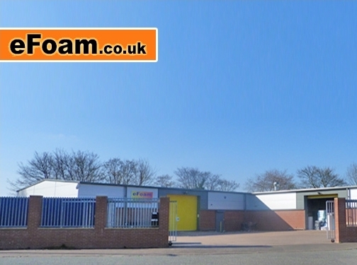 What the Website Is AbouteFoam is an online retailer and UK manufacturer of foam products for household, commercial and specialist uses. Its range includes foam cut to size, upholstery foam, sheets, cushions, mattresses and toppers, acoustic and packaging foam, insulation products, and aquatic filter foam. Visitors can request custom shapes and dimensions, order samples, or explore services such as cushion refilling. The site’s purpose is to help customers choose and buy foam online, with product information, custom pricing, and support by phone or email.Good Points and Trust Signals - Clear contact details: The site provides a freephone number and says staff are available from 8am to 5pm, Monday to Friday. It also offers email support.
- Established business: eFoam states it has more than 40 years of UK foam-manufacturing experience and dispatches orders from its own factory.
- Strong customer feedback: It reports an “Excellent” rating, with 32,932 verified reviews and a score of 4.87 out of 5. The site also identifies foam quality, delivery speed and value as customer strengths.
- Quality and safety claims: The company says it is ISO 9001 certified and that its furniture-grade foams comply with the Furniture and Furnishings (Fire) Regulations 1988 and amendments. It also states that all foam exceeds UK fire safety standards.
- Transparent pricing and delivery: Prices include VAT, and the site advertises free next-day delivery to mainland UK. It explains that orders are dispatched within one working day.
- Business identification: The website names Simply Foam Products Ltd, gives its company and VAT numbers, and provides links to terms and conditions and a privacy policy.
- Customer support resources: FAQs, video guides, a sample service and product information can help visitors make a suitable choice before ordering.
Improvements to Help Visitors - Correct the text and content inconsistencies. The page includes fragments of code, repeated wording and duplicated product references. Cleaning these up would make the information easier to understand and improve confidence in the ordering process.
- Make promotions unambiguous. The offer is labelled “October” and appears in different versions, including both 10% and 5% discounts. State the correct offer, its dates, eligibility and any exclusions, or remove it when it expires.
- Clarify contact information. The extracted phone details appear run together. Present each telephone number separately and label what it is for, so visitors can easily identify the right number.
- Explain delivery conditions fully. Highlight that free next-day delivery applies to mainland UK, and explain any postcode exclusions, order cut-off times or exceptions for made-to-measure products.
- Support product selection with practical detail. Provide clear comparisons of foam grades, firmness, density, intended uses and available dimensions. Explain how customers should measure custom-cut shapes and when a sample is recommended.
- Give more detail behind safety and quality claims. Specify which products meet each fire-safety requirement and provide relevant certification or testing information where available.
analysed on 15 October 2026
1. What the website is about (purpose)CartonPack is a New Zealand packaging company focused on corrugated cardboard packaging solutions. The site’s purpose is to attract businesses looking for custom packaging (made-to-order) as well as stock packaging products, and to convert visitors by encouraging them to request a quote. It also highlights core capabilities (manufacturing, printing, litho lamination, logistics/distribution) and positions the brand around a “rock solid” guarantee and customer satisfaction.2. Good points / trust signals - Strong trust message: “Your Trusted Packaging Partner” and “Rock solid guarantee on all cardboard products.”
- Guarantee detail: states that if customers aren’t happy, they can report concerns and the business will resolve them promptly.
- Customer testimonials: multiple long-form reviews mentioning helpful communication, patience, samples provided, quality of cuts, strong card, and consistent delivery.
- Sample + iteration process mentioned in reviews: customers describe receiving samples, reviewing real dimensions, and receiving additional samples if needed.
- Clear contact details: phone number (03 349 3293), email address ([email protected]), physical address, PO Box, and showroom hours.
- Showroom information: confirms where visitors can visit and when it’s open (Mon–Fri 8:00 AM–4:00 PM, or by appointment).
- Credibility via capabilities list: mentions litho lamination, logistics & distribution, manufacturing, and printing.
- Transparent product categorisation: custom packaging types (RSC, shelf ready shippers, base & lid, wine packaging, food packaging, etc.) and stock range items (RSC cases, journal boxes, postal boxes, pizza boxes, wine bottle range, etc.).
3. Improvements to help visitors - Make the quote process clearer: include what information is needed to request a quote (dimensions, quantities, artwork/printing needs, intended use, delivery location, timeframe).
- Add product proof elements: where possible, include typical specs/standards (materials, finishes, tolerances, turnaround times, shipping options) to reduce uncertainty before contacting.
- Improve testimonial usefulness: add the customer’s context where missing (industry, packaging type ordered, quantity, and outcome). This makes reviews easier to match to visitor needs.
- Clarify “guarantee” scope: specify what is covered (e.g., defects, incorrect dimensions, damages in transit) and how customers submit a claim.
- Reduce repetition/duplicate blocks: the content includes repeated navigation-like capability lists and product lists; consolidating it would make scanning faster and reduce confusion.
- Strengthen calls-to-action with specifics: the page uses “Request a Quote” and “Contact Us,” but could better state next steps (e.g., “Send your dimensions + quantity and we’ll respond within X business days”).
- Add location/coverage details for logistics: visitors would benefit from explicit coverage areas (nationwide in NZ) and typical delivery times.
- Make sustainable options more concrete: “Sustainable Options” and “Stock 100% Recycled…” appear, but a short explanation of what “100% recycled” means in practice would help buyers validate suitability.
analysed on 14 October 2026
1. What the website is about (purpose)The site for Wirken Photography presents a photography studio focused on weddings, corporate/documentary work, and family/birth photography. Its purpose is to persuade visitors to contact the team by highlighting a photojournalistic, unposed, authentic storytelling approach, supported by a track record and example sessions. The site emphasizes being “available worldwide” and positions the studio as a “top wedding photographers” choice with strong credibility claims.2. Good points / trust signals - Clear service scope: wedding, commercial/corporate, family/birth events.
- Strong positioning: “journalistic background,” “document the moment instead of manufacturing it,” and emphasis on authentic, timeless results.
- Social proof via publication: “Top 10 wedding photographers in the world” (American Photo Magazine).
- Experience and longevity: “since… over 15 years ago.”
- Credibility through named professional: “Tyler Wirken” is specifically mentioned and branded.
- Real client examples: multiple dated galleries/clients listed (e.g., “Emmy + Cam,” “Abby + Nick,” “Cassie + Max,” “Perry family,” etc.).
- Geographic reach: Kansas City base, plus destination weddings and travel to other cities.
- Trustworthy contact details:
- Physical address: 7410 Summit St, Kansas City, MO 64114
- Phone number: 816.582.8954
- Email: info@wirkenphoto.com
- Direct call to action: “Talk To Us!” with a form to request information.
- Ongoing presence: copyright listed as “Copyright 2026,” suggesting continued operation.
3. Improvements to help visitors - Clarify the booking process: explain what happens after a form submission (timeline for response, consultation call, contract, deposit, delivery dates).
- Add concrete package/deliverables info: approximate starting prices, what’s included (hours covered, number of images, albums/prints, turnaround time).
- Strengthen “available worldwide” with specifics: specify which services are travel-ready and whether travel fees apply.
- Expand testimonials: the page references testimonials conceptually (“pictures that matter”), but actual testimonial quotes are not shown in the provided text—add short client reviews with names/event types.
- Reduce ambiguity in the “top 10” claim: include the year and a clearer context (exact award/list name) to make the credibility statement easier to verify.
- Add clearer service distinctions: briefly differentiate how wedding coverage differs from corporate and family sessions (approach, deliverables, typical timelines).
- Form usability enhancements: consider adding guidance for fields like “TELL US ABOUT SOMETHING YOU LOVE!” (examples: venue, story priorities, photo style preferences).
- Remove stray/unclear text artifacts: phrases such as “TYPE AND HIT ENTER” and “@drug rehab Tampa” appear out of place; cleaning these improves visitor confidence.
analysed on 13 October 2026
1. What the website is about (purpose)The site belongs to Wayward, a video production company servicing Wollongong and Sydney (Illawarra and surrounding regions). Its purpose is to attract clients who need TV commercials, branded content, and social video—positioning Wayward as a full-service storytelling-focused production partner.2. Good points / trust signals - Clear service offering: states they produce “TV Commercials, Branded Content, Social Videos.”
- Geographic credibility: explicitly mentions Wollongong, Illawarra, and Sydney, helping visitors confirm local coverage.
- Full production capability: lists end-to-end process—“creative concepts, scripting, producing, directing… final edit and broadcast.” This signals they can handle projects from start to finish.
- Client collaboration promise: emphasizes working closely with clients to keep the experience “fun, on budget,” and deliver authentic storytelling.
- Notable brand associations: references work for recognized organizations including Universal Music, Sports Illustrated, University of Wollongong, University of Sydney, and Cadbury. This is a strong credibility indicator.
- Direct contact email: provides an email address (info@waywardfilms.com.au), giving visitors a straightforward way to reach the company.
- External portfolio signal: includes a Vimeo link (https://vimeo.com/waywardfilms), suggesting examples of their work are available.
- Clear positioning: highlights “Storytellers first and foremost” and “distinct and entertaining story’s… lasting impact,” aligning messaging with outcomes visitors care about.
3. Improvements to help visitors - Add stronger conversion-focused details: include clearer calls-to-action beyond email (e.g., “Request a quote,” “Book a consultation,” expected timelines, typical budgets or packages).
- Make outcomes more specific: translate claims like “lasting impact” into measurable or concrete benefits (e.g., delivery turnaround, campaign results, deliverables commonly produced).
- Improve proof quality: the text mentions a “huge range” of notable brands, but visitors would benefit from brief case-study style summaries (what was made, for whom, and results or key insights).
- Add testimonials (explicitly): there are no testimonials included in the provided text. Adding client quotes with names/roles would strengthen trust.
- Clarify “The Weedy One”: this appears as a work item or section, but visitors need a short explanation of what it is and why it matters.
- Strengthen contact details: only an email is shown. Including a phone number (if available) and business address (if available) would further increase trust.
- Fix text clarity issues: visible character encoding artifacts (e.g., HTML entities like “…”) and inconsistent apostrophes (“story’s”) reduce readability and professional polish.
analysed on 12 October 2026
1. What the website is about (purpose)This site appears to belong to a kosher catering business that plans and provides catering for major life events and celebrations. It highlights services for Rosh Hashanah ordering and event categories including weddings, corporate/organizational events, bar/bat mitzvahs, custom cakes, and cocktail-style celebrations. It also mentions “exclusive catering” at specific venues (including Adat Shalom Synagogue and Congregation Shaarey Zedek) and states they have catered across Southeastern Michigan for more than 35 years.2. Good points / trust signals - Clear service focus: The page explicitly lists major catering/event types (corporate, weddings, bar/bat mitzvah, custom cakes, etc.), helping visitors understand offerings quickly.
- Experience stated: “more than 35 years” of catering in Southeastern Michigan is a strong credibility signal.
- Venue credibility: Names specific established venues (e.g., Adat Shalom Synagogue, Congregation Shaarey Zedek) and claims “great relationships,” which builds trust.
- Testimonials present: Includes a positive customer review (“SO easy to work with and wonderful customer service…”), indicating social proof.
- Operational seriousness: Mentions “quality kosher catering” and tailoring events to client requirements and budgets.
- Range of event support: Emphasizes both large and small events (e.g., 30 guests up to 3000), suggesting capability at different scales.
- Dedicated ordering call: “Rosh Hashanah Ordering” and a “Start the process” prompt imply an actionable workflow for leads/orders.
- 3rd-party platform mention: “Private Event Software powered by Tripleseat” can act as a process/tracking trust signal (depending on implementation).
3. Improvements to help visitors - Add concrete contact details (at least on the visible content): The text provided does not include a clear street address, phone number, or email. Visitors benefit from immediate ways to reach the business.
- Expand testimonials: Only one testimonial is visible in the provided text. Add more reviews, ideally including event type, guest count, and location/venue.
- Clarify next steps: “Start the process” is present, but it’s not clear what happens after clicking (e.g., timeline, what information is required, response times). Provide explicit steps.
- Strengthen kosher clarity: Since the business is kosher, include details such as certification/accreditation (what authority, and for which items/services), and how kosher requirements are handled for different events.
- Provide service details visitors can compare: Add example packages or menus by event type (corporate luncheon vs. wedding vs. bar/bat mitzvah), and whether staffing, rentals, bar service, or rentals are included.
- Correct/clean up content quality: The text includes minor formatting artifacts (e.g., repeated “Slide” labels). Ensure event sections present clean, readable content without leftover slideshow text.
- Add location context: “Southeastern Michigan” is mentioned, but visitors would benefit from a clear service area range (cities/suburbs) and whether they cater outside the region.
|
 Our web spider - powered with AI - can identify good and bad points of each site it visits. Below you'll find a random selection of sites our spider has recently visited, along with its notes on what it has found. The reason we show you these spider audits is to help give you ideas on how you can improve your own website.

