Typography in Movie Posters: An Unnoticed Art
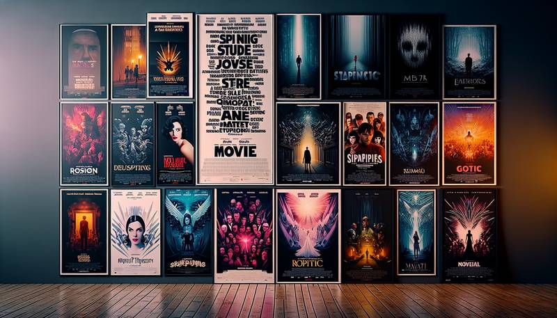
The Silent Star of CinemaTypography often takes a backseat in the glitzy world of movie posters, overshadowed by eye-popping graphics and star-studded faces. But why should text settle for a supporting role? This unsung hero—let’s call it the background vocalist of the film industry—has its job cut out: it not only conveys essential information but also sets the stage for the entire visual experience. It’s like a well-placed punchline that makes the entire joke land beautifully, even if no one ever remembers who delivered it.Fonts: Not Just for NerdsFonts can be as confusing as a cat who thinks it's a dog. Each typeface has its own personality, whether it’s a regal serif font that screams “epic saga” or a playful sans-serif that whispers “romantic comedy.” In the film world, the right font can evoke emotions, set moods, and even hint at plot twists. For a thriller, a jagged font might give chills, while a quirky font for a rom-com suggests a delightful romp through awkward encounters and meet-cutes.★ Serif Fonts: These have small lines at the ends of the strokes. They love history and a good cup of tea. Perfect for period dramas.★ Sans-Serif Fonts: These are clean and modern, like the friend who shows up on time. Ideal for action films or tech-driven stories.★ Script Fonts: These are the romantics of the font world, flowing like a love letter. Great for romance films or whimsical tales.★ Display Fonts: The wild child of the font family, these fonts can be anything from quirky to downright bizarre, much like a movie featuring Nicolas Cage in a role he was born to play.The Role of ColorImagine a world where all movie posters are just black and white. Yawn. Color is the life of the party, turning the mundane into the magnificent. The colors chosen for typography not only make it appealing but also convey deeper meanings. Red suggests danger or love—take your pick. Blue can evoke calm or sadness, depending on how the plot twists. It’s almost like mood rings for fonts, and while they don’t change color when you touch them, they sure do affect how you feel about the movie. Legibility MattersNow, let’s talk about legibility. You’d think it’s a no-brainer, but sometimes it feels like a brainteaser. How many times have you seen a stunning poster, only to squint at the text like you’re trying to read the fine print on a legal document? When a title looks like it was designed with a blindfold on, it can lead to confused moviegoers asking, “Is this a film about a cat or a vat?” No one wants that! A well-designed poster is like a welcoming hug—warm, inviting, and easy to understand.Typographic Trends Through the AgesTypography trends in movie posters shift like the seasons, and keeping up can be as challenging as finding the last piece of a jigsaw puzzle. Remember the days when 3D lettering was all the rage? It was as if every poster wanted to leap off the wall and give you a hug. Nowadays, minimalist designs are in vogue, making it seem cool to say less while saying it in a more artistic way. When it comes to trends, movie posters are basically the fashionistas of the design world.★ Vintage Styles: Throwbacks to retro typefaces give a nostalgic feel—perfect for films set in the past or that decide to “remake” themselves.★ Minimalism: Less is more, or so they say. A single word on a blank background can create intrigue faster than a magician pulling a rabbit out of a hat.★ Hand-drawn Typography: This trend brings a personal touch to posters, as if the designer just scribbled down their thoughts while on a coffee break.Typography: The Unsung HeroThe next time you gaze upon a movie poster, remember that behind every blockbuster title lies a typographic genius. These design wizards not only create art but also wield the power to communicate feelings, set the mood, and pique interest—all with a few carefully chosen letters. It’s like they’re providing the audience with a secret handshake; they might not realize it, but they’re already in on the joke before the movie even starts.A Font of KnowledgeAs you stroll through your local cinema or scroll through streaming services, take a moment to appreciate the typography enveloping your cinematic choices. Every letter has a story to tell, each font a unique personality. Who knew that letters could have more drama than the actors they’re advertising? Whether it’s a blockbuster or an indie flick, typography quietly steals the spotlight—proving that sometimes, it’s what’s below the surface that truly shines.
|
|