Mastering Typographical Design: A Journey into the World of Letters
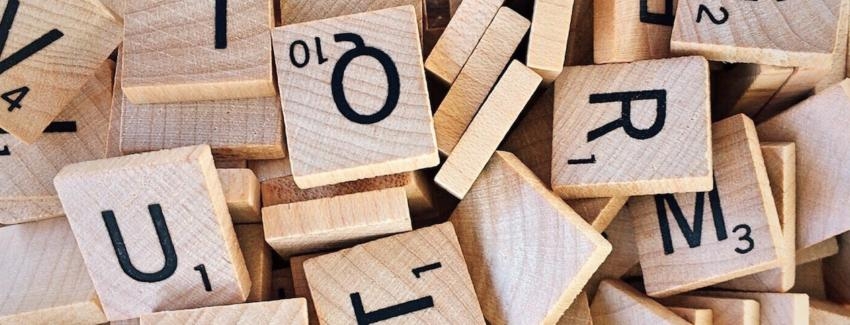
Why Typography Matters More Than Your Mom’s Secret Chili RecipeFew things in life are as important as a well-crafted sentence—except perhaps a good bowl of chili, but we digress. Typography is the unsung hero of communication, whether it’s the font on a cereal box or the heady layout of a classic novel. Typefaces can evoke emotions, steer decisions, and even influence your grocery shopping choices. That's right; the reason you can't resist those 'Limited Edition' snacks might be thanks to the elegant curves of the typeface.Typography is more than just letters on a page. It's an art form, a science, and sometimes, a riddle wrapped in an enigma, topped with a generous sprinkle of kerning. In essence, understanding typography can elevate your design game from “meh” to “WOW MY EYES!” faster than you can say “Comic Sans should be banned.”The Anatomy of Typefaces: A Crash CourseDelving into typographical design reveals intricate layers—much like an onion, but without the tears (unless you accidentally picked a bad serif). Here’s a quick guide to the parts of a typeface that could make any designer swoon: - Serif: The little feet and hats that adorn letters. Think of them as the fancy shoes you wear for a wedding; they may not be necessary, but they certainly elevate your outfit.
- Ascender: The proud part of a lowercase letter that reaches for the sky, like that one friend who insists on climbing every hill on a hike.
- Descender: The part of letters like “g” and “p” that dive into the depths, much like your ambition after binge-watching a series.
- Kerning: The space between letters, which can either create harmony or a rift wider than the gap between your New Year’s resolutions and reality.
Mastering these components can make typography less of a headache and more of a delightful puzzle. And remember, one misplaced letter can make a world of difference—ever seen a sign that reads 'All you can eat' versus 'All you can meat'? Exactly.The Impact of Font Choice: It’s More Serious Than You ThinkChoosing the right font is akin to selecting the perfect outfit for a job interview. You wouldn't show up wearing pajamas, would you? (Unless it’s a Zoom call, but that’s another story altogether.) The font you select sends subliminal messages to your audience, making it critical to understand the implications of your choice.- A bold sans-serif font might shout confidence and modernity.- A whimsical script can whisper creativity and playfulness. - Times New Roman? That’s the equivalent of showing up to a gala in a tuxedo—impressive but slightly predictable.For instance, imagine a government document printed in Comic Sans. It’s like finding a funky avocado toast at a formal event—entertaining, but also slightly alarming. Whitespace: The Unsung HeroLet’s take a moment to appreciate whitespace—the space around elements that allows them to breathe. Think of it as the social distancing of design. Just as too many people in a small room can create chaos, cramming too much text or imagery onto a page leads to visual clutter. It’s like a crowded buffet line at a family gathering—everyone jostling for position, and nobody really enjoying themselves.Whitespace can enhance your design by providing clarity, aiding comprehension, and creating visual interest. Embrace it like a long-lost friend and watch your designs flourish.The Final Letter: Typographic Bliss AwaitsMastering typographical design is less about adhering to strict rules and more about finding joy in the little things—like that perfect font pairing or achieving immaculate kerning. With every choice, you have the opportunity to create not just readable text, but a visual journey that invites your audience to engage. Don’t be afraid to experiment, make mistakes, and discover what you like. Typography is a playground for creativity where even the most obscure fonts can find their moment in the limelight. So as you embark on your typographical quest, remember that even the finest typefaces started as humble sketches. Dive deep into this world of letters and you’ll soon find yourself crafting designs that speak volumes—one beautifully arranged letter at a time!
|
|