5 Web Design Tips That Are Crucial in 2022
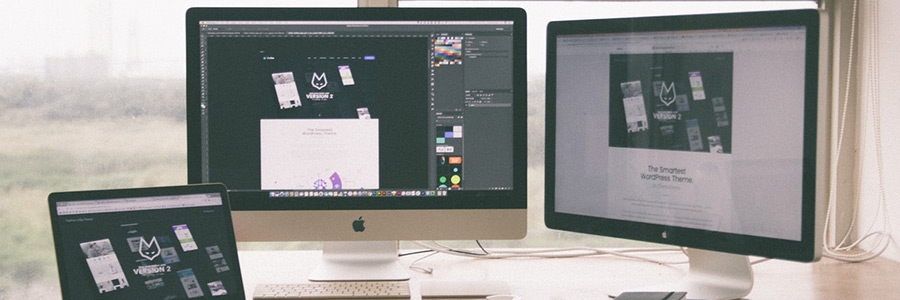
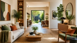
Designing with PurposeTo design a website that captivates users, it's essential to start with a strong purpose. Imagine trying to make a pancake that doesn’t have a reason to exist—just a sad, flat disk on a plate. Every element on your website should serve a clear function, whether it's informing, entertaining, or selling. Think of your website as a well-organized toolbox: if a hammer is missing in a DIY kit, good luck hanging that picture!But how do you align your design with purpose? Simple! Conduct user research that allows you to understand your audience’s needs. This can range from focus groups to good old-fashioned eavesdropping—just make sure to do it discreetly. You want insights, not restraining orders.Responsive Design: A Must HaveGone are the days when people only browsed on their chunky desktop computers. Today, websites need to be as flexible as a yoga instructor on their best day. Your site should adjust seamlessly across various devices. Picture a contortionist trying to fit into a telephone booth; comical, but not quite the aesthetic you want for your users.Utilizing a responsive design framework can save the day. It ensures that your website looks fabulous on a phone, tablet, and even a toaster with Wi-Fi (if that ever becomes a thing). This way, you’ll avoid the dreaded zoom-and-scroll routine that leaves users feeling like they’re trying to read a book through a kaleidoscope.Keep Navigation SimpleWhen users visit a website, they want to glide through it as effortlessly as a swan gliding across a pond—not like a chicken trying to find its way through a maze. If navigation is convoluted, users will take one look and leave faster than you can say “404 error.” To make sure your navigation is user-friendly, consider these key points:- Limit menu items to the essentials.
- Use clear labels that describe what’s behind each click.
- Incorporate a search bar for those who prefer a more adventurous approach.
Remember, the goal is to make navigation intuitive. A user should never feel like they just stepped into an escape room when trying to find your contact information.Visual Hierarchy: Organizing Like a ProVisual hierarchy is the secret sauce that separates the pros from the amateurs. Imagine trying to read a book where the end is at the front and the beginning is at the back. Confusing, right? The same principle applies to web design. To guide users through your content effectively, employ various design techniques such as:- Contrast: Use color differences to emphasize key information.
- Size: Bigger items naturally draw attention, so make your call-to-action buttons pop like champagne on New Year’s Eve.
- Spacing: Negative space is essential—it keeps your content from looking like a crowded elevator.
By organizing your website elements thoughtfully, you're not just creating a pleasing aesthetic; you're leading users on a delightful journey through your site.Speed: Because No One Likes to WaitIn a world where even our microwave dinners are ready in minutes, website speed matters. Users are like toddlers with a cookie—impatient and ready to throw a tantrum if they have to wait too long for satisfaction. If your site takes longer than a sloth convention to load, don’t be surprised if you see users bouncing away faster than they can click the back button.To amp up your website's speed, consider these strategies:- Optimize images and files.
- Minimize HTTP requests by consolidating files.
- Leverage browser caching like a savvy hoarder sorts their collectibles.
A fast website keeps users engaged, making them more likely to stick around. Plus, it pleases search engines, which in turn can help boost your rankings—talk about a win-win!Final Thoughts: Don't Let Your Website be a Ghost TownWith these five crucial web design tips, turning your website into a user-friendly paradise shouldn’t feel like mission impossible. Remember, a well-designed website is like a party where guests feel welcome and want to stay. Just avoid the web design faux pas that could leave your users feeling like they’ve wandered into a ghost town. After all, nobody wants a website that feels like a deserted carnival, complete with rusty rides and deflated balloons.
|
|