designerlistings.org
The most comprehensive human-review directory for design-related services
★ Get your own unique FAQ + Selling Points on your profile page
★ be seen by 1000s of daily visitors and win new business
designerlistings.org Miniblog
What Went Wrong at Porsche? When Brilliant Design Isn't Enough
 Porsche can draw a car so cleanly that you recognise it from a shadow. What it cannot do, apparently, is sketch its way out of a tariff bill the size of a small national embarrassment.
The company’s design instinct remains superb. The 911 still looks like a 911 without feeling embalmed. But elegant metal has collided with ugly arithmetic. Operating profit slumped from €5.64 billion in 2024 to €413 million in 2025. Margin fell from 14.1% to 1.1%. Revenue slid 9.5%.
This was not one mistake. It was a queue of them, all turning up at once and talking over each other. Porsche absorbed hefty costs from restructuring and a rethink of its product plans. Battery-related spending added more pain. US tariffs then landed a €700 million thump. China, once a dependable goldmine for premium German brands, has become harsher and more crowded.
So Porsche has eased off the all-electric rush, delaying some EVs while keeping combustion and hybrid models alive. Sensible, perhaps, but also revealing. Customers do not always move at the speed executives announce.
The first quarter of 2026 brought another 15% drop in global deliveries, though the 911 managed a 22% rise, because icons can still do some heavy lifting. First-half 2026 offered a modest recovery: operating profit climbed to €1.35 billion and margin improved to 7.8%, despite lower revenue and deliveries.
The lesson is simple and slightly brutal. Great design sells cars. It does not manage timing, tariffs or strategic nerves.
Posted on 25 September 2026
When Clean Branding Becomes Instantly Forgettable
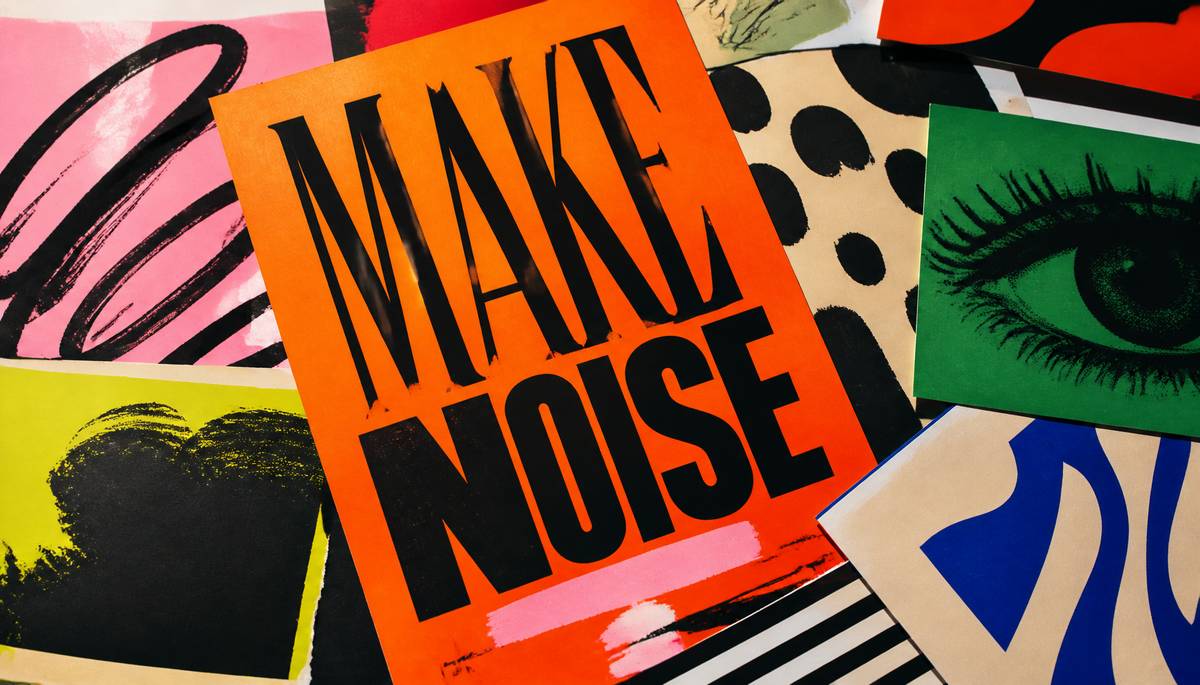 For years, branding seemed to be on a strict diet: sans-serif fonts, acres of white space, tasteful beige, and the visual charisma of a very expensive waiting room. It looked tidy. It looked competent. It also meant half the high street and most of the internet started resembling one long, polite shrug.
That’s why personality creeping back into graphic design feels less like a trend and more like a correction. Typography is getting louder, stranger, and far more enjoyable. Letters are stretching, swaggering, and occasionally behaving like part of the artwork instead of dutifully carrying information from A to B.
Illustration is helping too. Hand-drawn marks, collage, rough edges and textures with a bit of grit can give a brand an actual pulse. Even digital images are often being made to feel tactile, as if a human hand has been involved somewhere along the line. Imagine that.
Colour is another obvious shift. Rather than defaulting to muted safety, designers are using sharper contrasts and more unexpected combinations, the sort that stick in your mind rather than sliding straight out of it.
Minimalism still works, of course, when it suits the message. But not every company needs the same hushed visual language. Especially now, when polished design is easier to produce than ever, being merely professional is no longer enough. Design must communicate, yes. But it should also be memorable. Otherwise, what exactly is the point?
Posted on 20 September 2026
Flat Design Is Dead; Texture Is the New Luxury
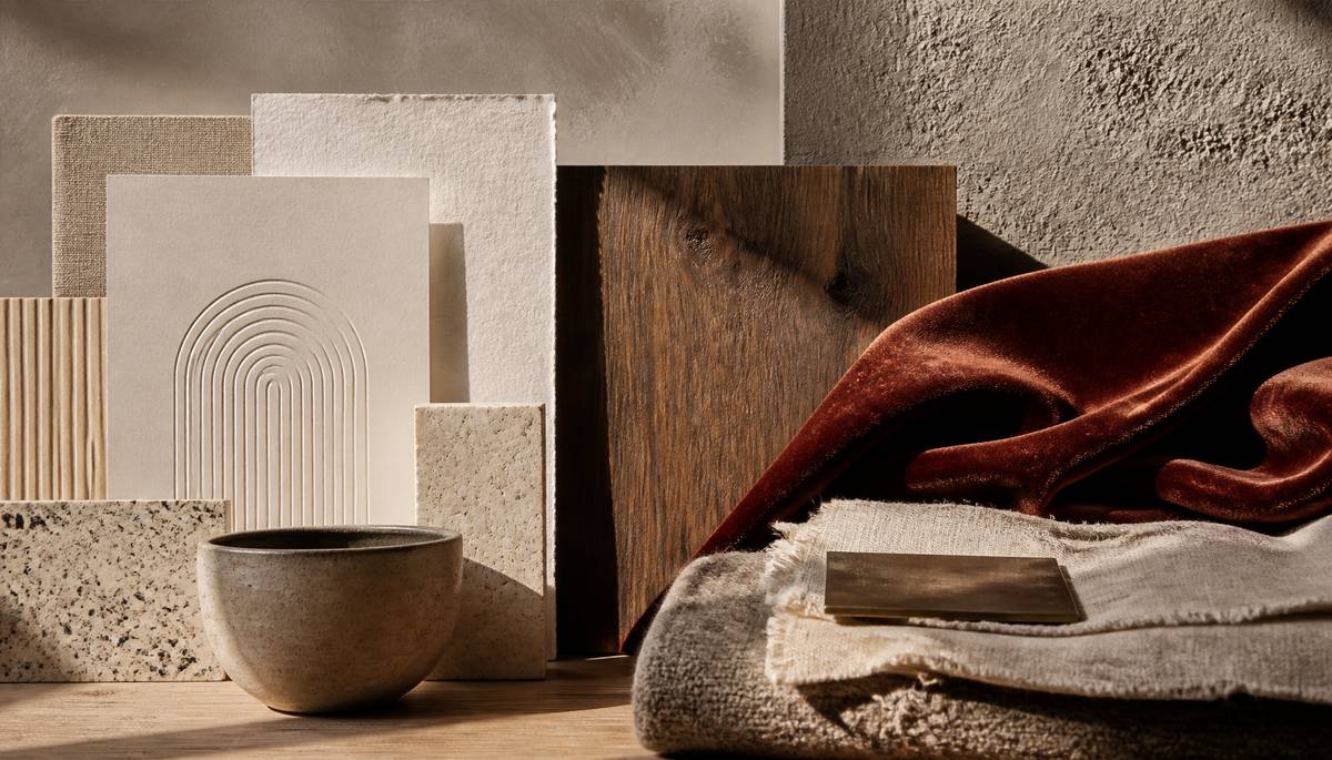 Flat design had its immaculate little moment, all smooth cheeks and no fingerprints. Now texture is swaggering back in, wearing scuffed boots and a velvet jacket.
Colour still matters, obviously, but surface is doing far more of the emotional heavy lifting. In packaging and print, tactile finishes can turn a simple object into something people want to hold rather than just glance at. Embossed type, raised patterns, textured stock and uncoated papers all add character without shouting. Even minimal design feels more distinctive when the material itself has a voice.
On screen, designers are faking that sensation with grain, layered images, odd little imperfections and soft shadows. After years of sterile flatness, that visual roughness makes digital work feel warmer, more human, less like it was assembled in a laboratory by a very tidy ghost.
Interiors prove the point best. A room doesn’t need loud colour if it has proper contrast in its surfaces. Timber, stone, plaster, linen, wool and textured ceramics can make a quiet palette feel rich and considered. Beige, in other words, has to earn its keep. Smooth sameness won’t do.
The real magic is in the mix: rough beside polished, soft against concrete, metal cutting through wool. Texture gives designers another way to build identity without inventing increasingly fussy colour schemes. We don’t just judge what things look like now. We judge what they seem as if they might feel like too.
Posted on 14 September 2026
The Real Design Boom Is Happening Far From London
 Britain’s design economy is no longer a London story with a few provincial footnotes. It is becoming a national force, and the numbers are hard to ignore.
In 2023, design contributed £136.7 billion in gross value added to the UK economy, up 40 per cent on 2019, according to the Design Council. That puts it ahead of retail, which stood at £114 billion, and makes design responsible for roughly one pound in every twenty generated across the country. It is also nearly twice the size of accommodation and food services, worth £70 billion.
What makes this shift especially striking is where the growth is happening. Wales has seen an 88 per cent rise in design’s economic contribution since 2019. The northeast is up 67 per cent, and Scotland 32 per cent. London still matters, of course, but it no longer has the stage to itself.
Employment tells the same story. Design now supports 2.27 million jobs after adding around 297,000 since 2020, a 15 per cent increase while total UK employment grew by less than 2.5 per cent.
Most of this work sits outside traditional studios. Four in five designers are embedded in other sectors, from NHS digital teams to financial services and gaming. Digital design now makes up 59 per cent of the sector and employs more than one million people. The real boom, then, is not only far from London. It is far broader than many still imagine.
Posted on 8 September 2026
Calm Interiors Fail The Moment Furniture Stops Serving Real Life
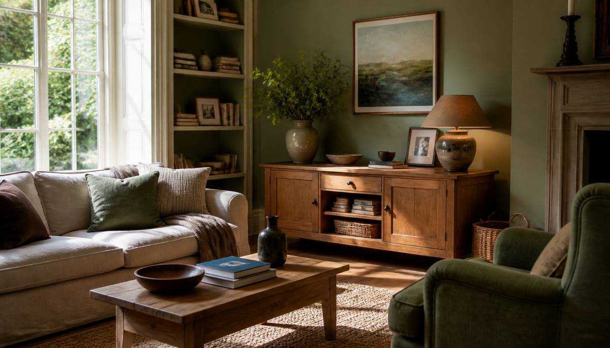 A room may aspire to tranquillity, yet the illusion is quickly spoiled when the chairs are handsome but uninviting, the tables too scarce to be useful, and storage sacrificed for the vanity of emptiness. Calm is not the same thing as absence. A house ought still to look as if people have the good sense to live in it.
Colour does much of the early work. Quiet, neutral schemes are often successful, though they need not be condemned to relentless white and grey. Soft blue, muted green, warm brown and other earthy tones can settle a room admirably while preserving a little spirit.
If decoration is restrained, texture must take up the conversation. Wood, linen, wool, woven pieces and ceramics lend interest without noise. Even a limited palette can feel layered and generous when surfaces differ.
Arrangement is equally important. Open space is pleasant; useless space is another matter. Seating should be comfortable, tables easy to reach, and storage sensible enough to conceal the unruly facts of daily life. A sparse plan that ignores ordinary habits is merely inconvenience dressed as taste.
Personal belongings should not be banished entirely. A few books, photographs, pictures or cherished objects often create more warmth than shelves crowded with items chosen only to fill a gap. Add daylight by day and softer lamplight by evening, and the room may feel calm, but never vacant.
Posted on 31 August 2026
Why Does The GV90 Hide Its B-Pillar?
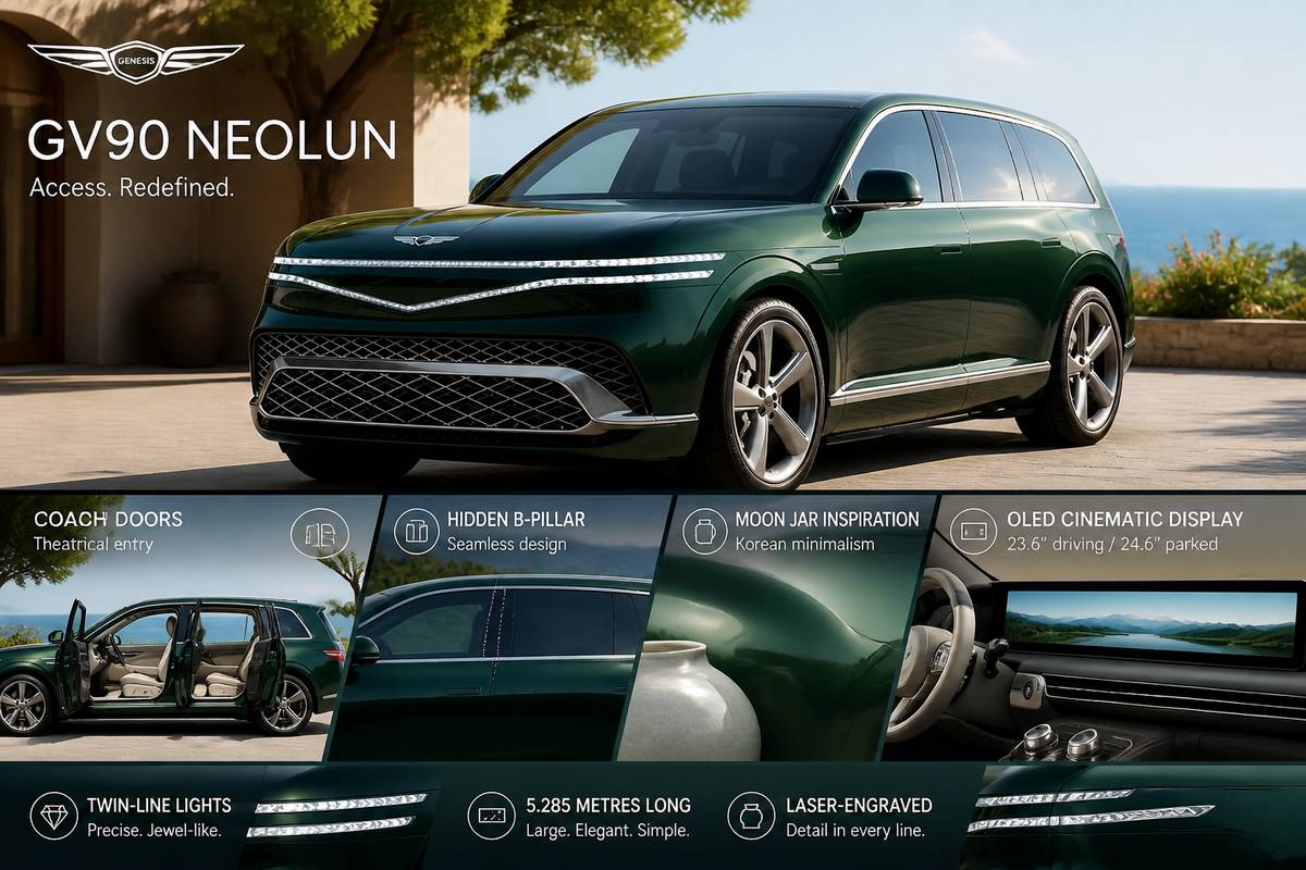 The GV90 hides its B-pillar for one simple reason: to make entry feel theatrical, spacious and unusually calm. On the GV90 Neolun, Genesis uses coach doors with a concealed central pillar, so the front and rear doors can open together in opposite directions. The effect is less about novelty than access. Step in, and the side of the car seems to clear away.
It also fits the car’s design logic. Genesis says the GV90 stays close to the 2024 Neolun concept, and that influence shows in its clean, uninterrupted surfaces. A visible B-pillar would have broken up that smooth profile. By tucking it out of sight, the Neolun keeps the body looking more sculpted and pared back.
That restraint runs through the rest of the SUV. At 5.285 metres long, it is a large car, yet the styling aims for simplicity rather than fuss, drawing on the moon jar, a classic symbol of Korean minimalism. Even the lights are worked neatly into the body with laser-engraved detailing, while Genesis’s twin-line motif adds a precise, jewel-like touch.
Inside, both GV90 versions get a huge OLED Cinematic Display. It measures 23.6 inches while driving, then stretches to 24.6 inches when parked at the press of a button. Practical? Partly. A statement? Absolutely. Posted on 23 August 2026
Timeless Design Is Not Boring-It Is Ruthless About What Stays
 Fashionable design can be like a loud dinner guest: great fun for ten minutes, then you’re stuck with it in the wallpaper. Timeless design avoids that fate by being choosy, even severe, about what earns the right to remain.
That usually means simplicity, though not the sort that looks as if nobody bothered. Clean lines, sound proportions and materials chosen with a bit of judgement tend to keep their dignity. The personality comes from detail, not from piling on whatever visual craze is currently doing the rounds.
Usefulness is just as important. A chair wants to be comfortable, not merely photogenic. A website should be easy to move through, not a maze designed by a committee with artistic feelings. A room must still suit the people living in it long after the paint chart has moved on. Good design sorts the problem first and adorns it afterwards.
Colour and typography matter too. Bold trend-led combinations can make a quick splash, but quieter palettes and established typefaces usually wear better. They give a design room to breathe and adapt.
There’s also the small matter of money and waste. Replacing furniture, branding or decor simply because fashion has had a wobble is expensive and needless. Trends will always have their turn, and some do grow into classics. But lasting design survives because its purpose, proportion and character still make sense years later.
Posted on 16 August 2026
How AI Accidentally Made Handmade Design Explode
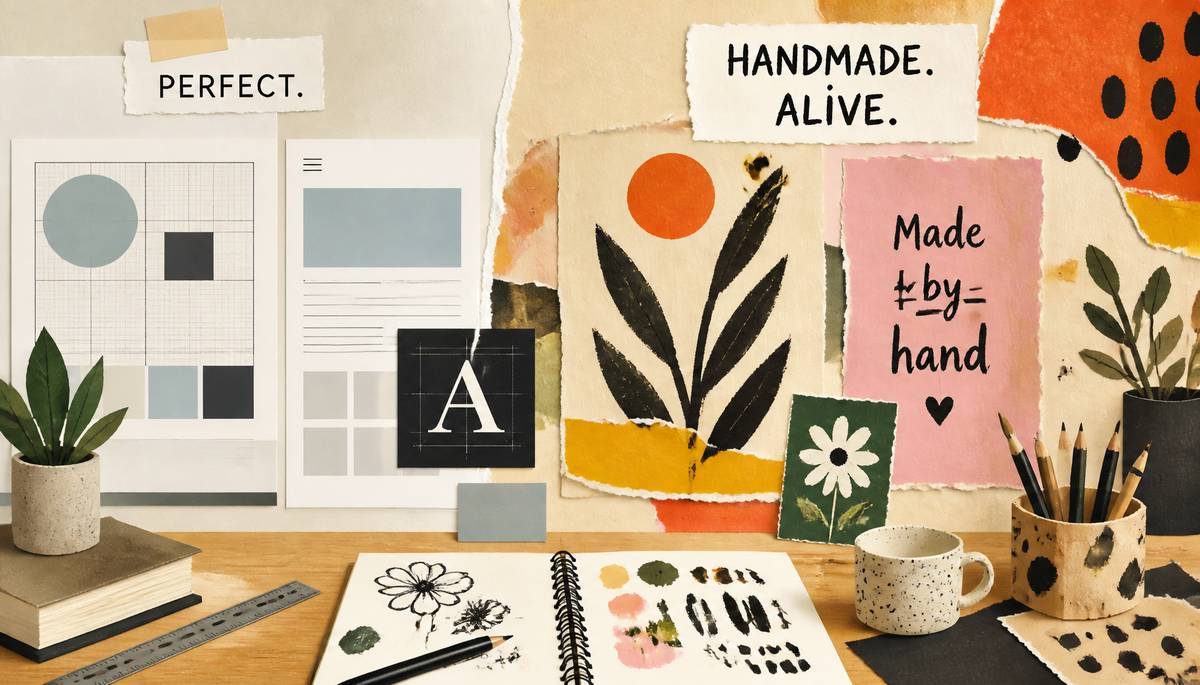 Perfect used to be the flex. Designers chased clean grids, exact spacing and that satisfying kind of symmetry that makes you want to whisper, “Nailed it.” Now immaculate work is cheap and everywhere, and suddenly the wonky stuff has swagger.
That helps explain why handmade design is having a moment across branding, packaging, websites, illustration and even interiors. A slightly off-kilter line, a brush mark you can actually see, lettering that looks drawn by a person with a pulse: these details break the spell of digital polish. They feel specific. Chosen. Alive.
The trick, of course, is that good imperfect design is not a mess in a funny hat. It is still designed. Rough textures work because they sit inside thoughtful layouts. Handwritten type still has to be readable. There is a world of difference between intentional irregularity and something that looks like the designer sneezed on the screen.
Part of the appeal is simple contrast. After a day of flawless imagery and perfectly aligned everything, an uneven arrow or oddly proportioned illustration catches the eye because it feels human. As pristine visuals become easier to make, perfection stops being special.
That is the twist. Technology spent years helping designers erase irregularities. Now those irregularities are exactly what give work character, warmth and a sense that somebody’s hand, not just a tool, was involved.
Posted on 12 August 2026
The Real Reason Layered Lighting Makes A Room Feel Instantly Richer
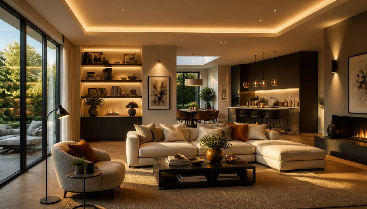 A room looks expensive when the light does more than simply let you see. That’s the trick of layered lighting: it gives a space depth, purpose and mood in one go.
A single ceiling fitting flattens everything. It blasts the room evenly, but it rarely does it any favours. Layered lighting works differently. You build from ambient light for general brightness, add task lighting where life actually happens, and finish with accent lighting to pull focus towards art, shelving, texture or architectural details. Suddenly the room has contrast. It feels considered.
Natural light still does the heavy lifting. Big windows, skylights and glazed doors can make a space feel broader, cleaner and more connected to the outside. That’s why designers often place furniture carefully and lean into paler finishes to help daylight travel.
Once the sun drops, artificial lighting takes over the atmosphere. A reading lamp by a chair, under-cabinet lights in a kitchen, a wall light grazing across plasterwork, a pendant that doubles as sculpture — each layer adds function, but also quiet confidence. Even switched off, a strong light fitting can shape a room’s identity.
LED technology and smart controls have made this easier. You can adjust brightness and colour temperature in seconds, shifting from crisp and practical to soft and relaxed. That flexibility is what makes a room feel richer: not louder, just better judged. Posted on 3 August 2026
How Swatch Smuggled Serious Mechanical Cred Into A Pop-Art Pendant
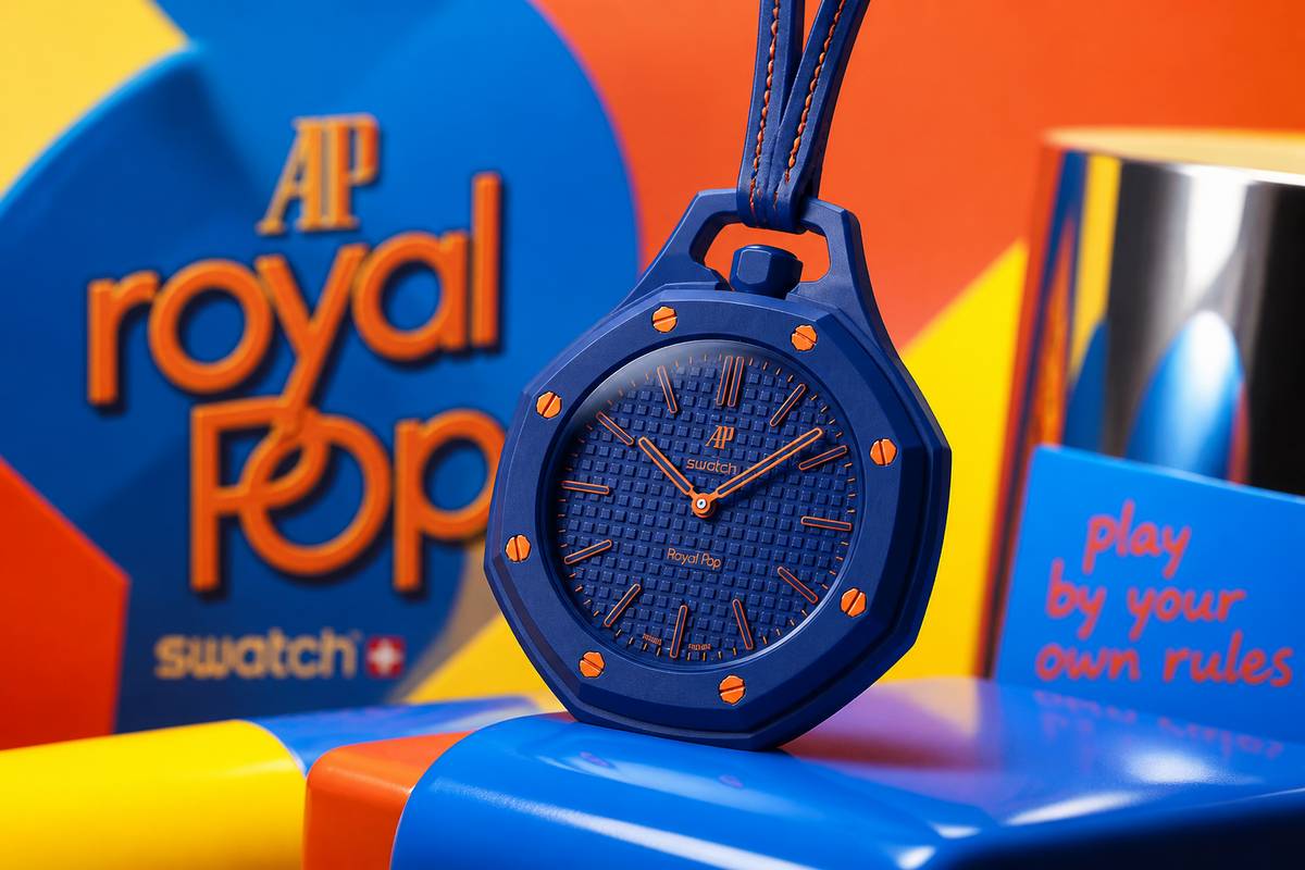 Swatch has done something faintly insolent and rather clever: it has taken the solemn codes of the Audemars Piguet Royal Oak and turned them into a pendant, pocket watch and bag charm without making the whole exercise feel like sacrilege.
The new Royal Pop collection, created by Swatch boss Nick Hayek and Audemars Piguet CEO Ilaria Resta, comes in eight bioceramic models. Six are simple time-only pieces, while two add a small-seconds display. Some place the crown at 12 in old-school pocket-watch fashion; others shift it to 3. None are made for the wrist, which feels pointed.
The visual cues are unmistakable: octagonal bezel, exposed hexagonal screws, Royal Oak-style dial geometry, sapphire crystals front and back. Yet the mood is pure Swatch: bright colours, multilingual names and a refusal to behave. You can wear one on a calfskin lanyard, clip it to a bag, carry it loose, or prop it up on a desk stand.
The genuinely serious bit sits inside. Swatch’s SISTEM51 appears here in a new hand-wound form with 15 active patents, more than 90 hours of power reserve, a Nivachron balance spring and factory laser regulation. That is not toy-shop engineering.
Better still, Audemars Piguet says its share of proceeds will fund the preservation of watchmaking skills and training for future talent. A mischievous object, then, with proper mechanical credibility. Posted on 29 July 2026
Mobile Killed Bad Layouts: Why Composition Matters More Than Ever
 Bad layouts used to hide in the roomy sprawl of desktop screens, like untidy relatives concealed behind a large sofa. Mobile saw to that. Shrink a design to the width of a hand and every weak decision starts shouting.
That is why composition matters more now, not less. People flick past hundreds of posts, products and headlines in minutes. A design has only a moment to explain itself. If the eye doesn’t know where to go first, it goes elsewhere.
Good composition gives it a route. A clear focal point, sensible balance and enough empty space to let things breathe make information easier to grasp at a glance. Contrast does the heavy lifting after that. Differences in size, colour, type and spacing create order, so the important bits look important and the supporting details know their place.
Simplicity helps too, though it is often mistaken for doing less work. In practice, it means choosing one message and removing the decorative chatter that muddies it. That usually makes a design more memorable, and far more adaptable across phones, tablets and desktops.
Mobile did not abolish the rules of design. It exposed why they exist. Readable type, responsive layouts and properly scaled graphics are not refinements; they are the difference between being understood and being scrolled past.
Posted on 24 July 2026
Did Samsung Finally Fix The Fold's Biggest Flaw?
 Samsung may finally have realised the Galaxy Fold’s biggest problem was not the folding bit. It was the closed-phone bit. You paid for a futuristic device, then spent half your day using a front screen that felt like typing on a TV remote.
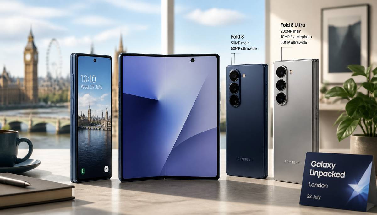
Leaked Galaxy Z Fold 8 renders suggest a much wider, shorter design, with a 5.5-inch outer display in a 16:10 ratio and a 7.6-inch inner screen closer to 4:3. In plain English: less awkward when shut, more tablet-like when open. If that holds up, it would be the first Fold that feels properly usable without unfolding it every five minutes.
Samsung also seems to be splitting the line in two. The standard Fold 8 looks aimed at people who never got on with the old narrow shape, while the Fold 8 Ultra reportedly sticks closer to the Fold 7 formula and adds the stronger camera setup: a 200MP main sensor, 10MP 3x telephoto and 50MP ultrawide. The regular model is tipped for a 50MP main and 50MP ultrawide. Both are expected to use the Snapdragon 8 Elite Gen 5 for Galaxy with 12GB of RAM.
There is a catch, because of course there is. A redesigned hinge is rumoured to reduce the inner crease substantially, but it may also make Flex Mode less steady at certain angles. So Samsung may have fixed one annoyance by slightly bruising another.
Now the real questions are price, software optimisation and whether this wider shape actually feels normal in the hand. We should know more at Galaxy Unpacked in London on 22 July.
Posted on 14 July 2026
Character.AI Just Turned TV Characters Into People You Can Interrogate
 Character.AI has decided that watching a drama isn’t quite enough; now you can cross-examine the cast afterwards like a mildly suspicious detective.
The company is moving into microdramas with three short-form series: the romance Last Summer, the horror story The Nighttime Game, and Eden Fall, a survival thriller with more than a whiff of The Hunger Games about it. The hook is simple and rather clever: adult users can chat directly with the characters, quiz them about events, and even push the story into roleplay territory.
That gives it something most short-video rivals don’t have. Plenty of firms are chasing the microdrama boom, from TikTok and Instagram to Peacock, Amazon Prime and India’s JioHotstar. Character.AI, though, is leaning on the thing it already does best: making fictional people unnervingly available.
For now, the shows are being produced in-house using automated production tools. The longer-term plan is to hand those methods to users so they can build their own characters, series and fanbases.
This sits neatly with the company’s recent push towards entertainment. It has already previewed Lorebook for world-building, introduced Books for stepping into classic novels, and is testing c.ai FM for audio serials and c.ai Reads for fiction. Some professional writers are already using the audio tools through its Labs programme.
There’s clearly demand. According to Sensor Tower, users spent more than 950 minutes a month on the platform in the first half of 2026.
Posted on 9 July 2026
After the Sketch: How AI Is Recasting Design
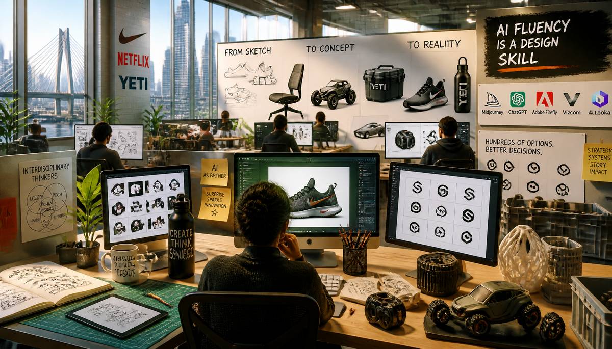 Four years after Midjourney and ChatGPT arrived, design has become a different creature altogether: quicker, less romantic, more strategic. The old rites—sketching, rendering, resizing, layout work—are being swallowed by software, and with them vanishes the notion that mastery of Photoshop, Illustrator, SolidWorks, Keyshot, or Figma is the designer’s central credential.
In Boston, Pilot Agency, known for work with Nike, Netflix, and Yeti, is already favoring interdisciplinary thinkers over pure virtuosos. At IDEO, long a citadel of industrial design, a 32 percent workforce cut last year exposed the larger weather system. Across firms, hiring and workflow are being rebuilt around AI.
Adobe Firefly, Vizcom, Adam CAD, ChatGPT, Midjourney, and Looka now let even non-designers produce polished concepts. Branding teams can sift through hundreds of logos in a sitting; product groups can turn sketches or text prompts into physical concepts in minutes, compressing weeks of labor. The designer’s hand is yielding to the designer’s judgment.
Even AI’s hallucinations, a vice in STEM, can be useful here, because surprise is sometimes the mother of invention. Yet the unease is real: Ted Chiang has argued AI can mimic without inner life, while Jay Dettling has warned about proprietary data leakage, though closed-source training and federated learning offer safeguards.
Design schools, like studios, must now teach AI fluency as a survival skill.
Posted on 3 July 2026
Runway Patina: Why Fashion Keeps Borrowing Old Rooms
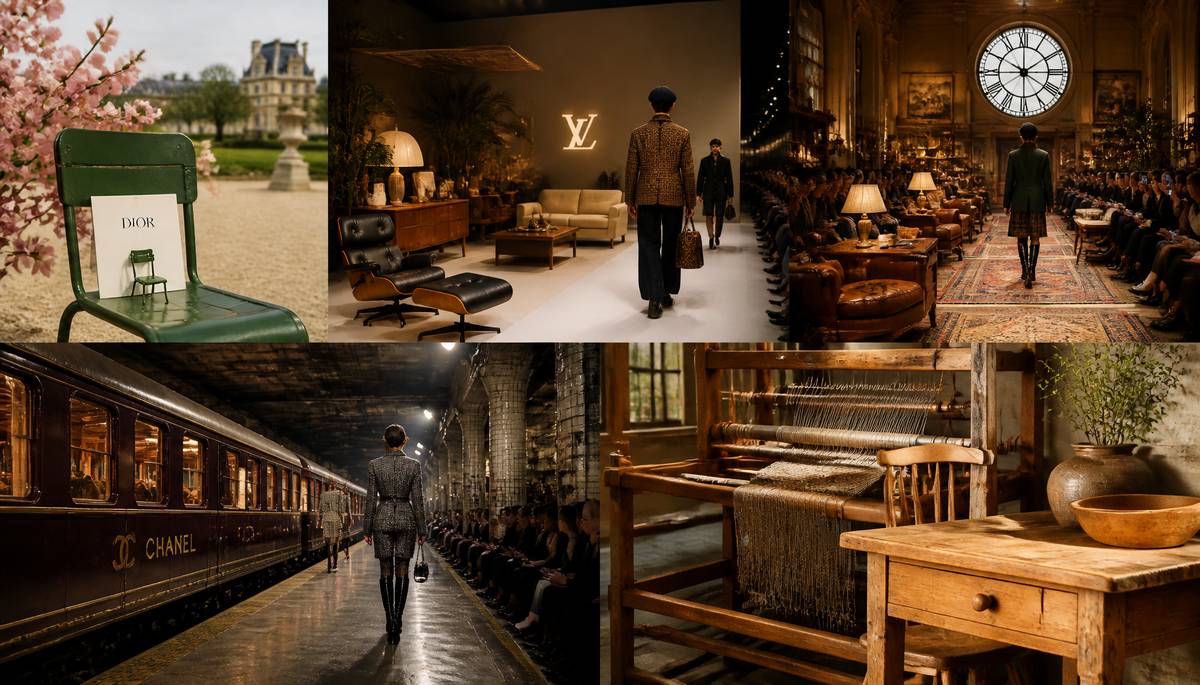 In 2026, fashion’s newest flex may be old furniture: not as décor, but as borrowed history.
Jonathan Anderson opened Dior’s fall/winter 2026 womenswear show in March at the Jardin des Tuileries with miniature green Sénat chairs as invitations, turning the 1923 public-garden seat into the collection’s emblem. In January, Pharrell Williams and Not a Hotel built Drophaus, a midcentury-leaning domestic set, for Louis Vuitton Men’s fall/winter 2026 runway. In February, Ralph Lauren staged fall 2026 among vintage rugs and antique seating inside New York’s beaux arts Clock Tower building. In December 2025, Matthieu Blazy unveiled his first Métiers d’Art collection for Chanel beside a vintage train in an abandoned downtown Manhattan subway station.
The move reflects more than nostalgia. In a culture flattened by screens, archived icons offer what clothing alone can’t instantly generate: place, memory, rigor, and the feeling that a world existed before the look arrived. Jonathan Olivares argues that design now gives fashion architecture around the body, while long-developed 20th-century furniture carries stability and conviction that fast seasonal churn struggles to project.
Chris Black notes that brands borrow prestige from already-canonical places and objects; Dior did not create the Sénat chair’s meaning. Adam Charlap Hyman sees vintage interiors as evidence of life, not just styling. Vejas Kruszewski points to antique looms preserved for their irregular texture. Flynn McGarry, lately buying vintage pine, values the unrepeatable tone of aged wood and the afterlife of rediscovered things.
Posted on 1 July 2026
Ikea PS 2026 Turns Practical Furniture Into Play
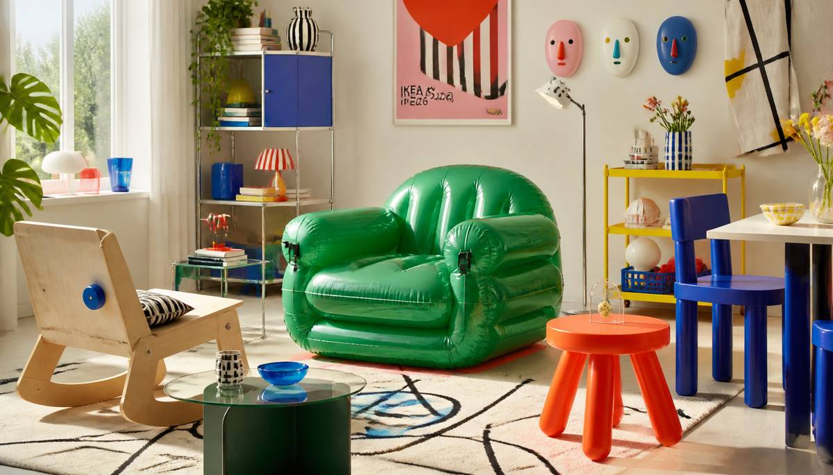 Ikea has unveiled Ikea PS 2026, a 44-piece collection built around what it calls playful functionality: furniture and objects that do useful things, then wink at you a bit.
The PS line began in the 1990s as Ikea’s experimental workshop for domestic design. The idea was rather bold and very Swedish: if Scandinavian design was being copied and sold at absurd prices, why not make the real spirit of it available to people without heroic wallets? Over three decades, that ambition has moved through themes including The Democratic Home, Inspired by History, Designed for Today, and now this latest chapter.
At the centre of PS 2026 is a simple proposition: plain design needn’t be dull. Maria O’Brian, Ikea’s creative leader, frames the collection as an exercise in discovery, where pared-back forms hide extra functions and small surprises.
That mood runs through the range. There’s a rocking bench, an inflatable armchair, wall masks, and adjustable pieces intended to invite use rather than reverence. It’s furniture you’re meant to prod, shift, sit in, and generally get on with.
Designer Mikael Axelsson’s inflatable chair captures the point neatly. Instead of treating design as a sacred relic, PS 2026 pushes it toward curiosity, interaction, and everyday delight.
Posted on 27 June 2026
Architecture’s New Overeager Intern Is Already in the Design Meeting
 At Gensler, AI moved from curiosity to infrastructure fast. Three years ago, the firm opened an internal AI sandbox to test generative tools before the architecture world fully settled on whether to trust them. Now AI touches most of the roughly 3,000 projects Gensler handles each year.
The payoff is not robotic authorship so much as amplified imagination. Designers use AI to study daylight, acoustics, circulation, occupancy, ventilation, and energy use before a building exists in concrete, steel, or expensive regret. On Under Armour’s new headquarters in Baltimore, Gensler used AI to model how employees might move through the building over a day and how that behavior would affect environmental performance.
The firm also adopted RunDiffusion about six months ago; within four days, more than 3,000 staff were trained. The result has been a burst of rapid concepting and a new strength in presentation: AI-generated visuals turned into cinematic narratives helped Gensler pitch a mixed-use district near a future stadium and imagine Baghdad Sustainable Forests, the largest ecological development in Iraq.
Elsewhere, caution remains sturdy. A 2025 American Institute of Architects study found about 90% of architects surveyed worried about inaccuracies, security, and separating AI-made from human-made work. Pratt’s Jason Vigneri-Beane and UNC Charlotte’s Sabri Gokmen see AI as especially useful early on, with Gokmen also developing a model that can generate 3D tower forms from prompts or images.
Posted on 26 June 2026
Architect Labs Wants to Make Custom Chips Less Like Alchemy
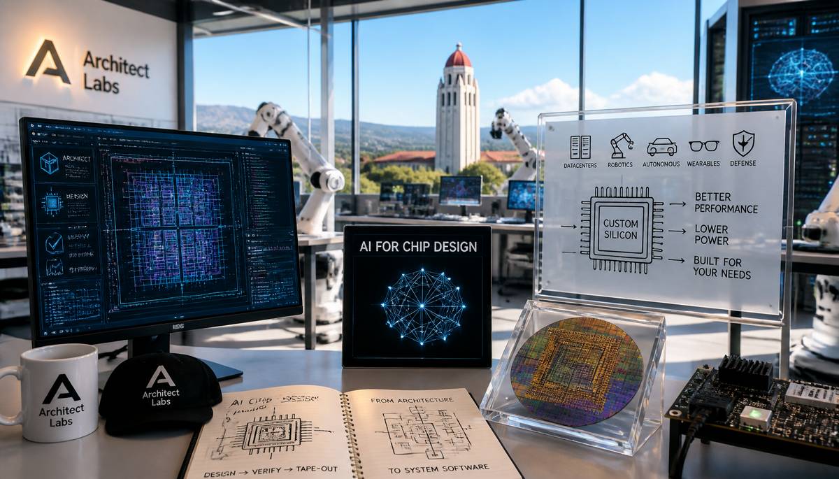 Custom chip design has long been the technological equivalent of trying to assemble a dragon from IKEA instructions: expensive, slow, and reserved for a tiny priesthood of specialists. Palo Alto-based Architect Labs wants to smash that bottleneck.
The startup has emerged from stealth with a $24 million seed round led by Kindred Ventures, with backing from TQ Ventures, Race Capital, Together Fund, and investors including Srinivas Narayanan, Lukasz Kaiser, Aravind Srinivas, Kunle Olukotun, Trevor Blackwell, Dr. Alex Wissner-Gross, Shaad Khan, plus executives from NVIDIA, Google, and OpenAI. Kindred founder Steve Jang has joined the board.
Founded by Stanford dropouts Ebrahim Hussain and Aaditya Subedi, Architect Labs is building an AI system that designs and verifies chips from end to end, then extends into compilers, runtimes, system software, and eventually AI-model co-optimization. The aim is to let companies, labs, and even nations build custom silicon without becoming chip companies themselves.
That matters because AI infrastructure is shifting beyond generic GPU-CPU-memory setups toward specialized hardware for datacenters, robotics, autonomous systems, spatial computing, defense, personal devices, and wearables.
Hussain previously worked on custom chips at Apple and Tesla after entering college at 15. Subedi researched AI-based code verification at Harvard. Their team includes veterans from Anthropic, DeepMind, xAI, Meta, Google, Intel, and others, with 80-plus tape-outs and leadership across major silicon and AI programs. The new funding will support compute, research, and early production partnerships.
Posted on 20 June 2026
Adidas’s 2026 World Cup Ball Tries to Be Less Chaos, More Physics
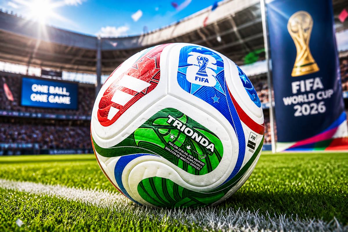 Soccer finally did what your ex never could: committed to consistency.
Wind-tunnel testing suggests the 2026 FIFA World Cup ball, Adidas’s Trionda, should fly more reliably than some of its chaotic ancestors. Physics researcher John Eric Goff and collaborators in Japan found that the new four-panel ball keeps a steadier drag coefficient down to about 12 meters per second, avoiding the ugly mid-flight aerodynamic surprise that made the 2010 Jabulani infamous with goalkeepers.
That earlier ball hit a drag crisis around 20 m/sec, meaning its resistance changed abruptly as it slowed. For a keeper, that’s less sport and more jump-scare.
The Trionda uses the fewest panels ever in a World Cup ball, but Adidas appears to have dodged the usual smooth-ball curse by roughening the surface. Each panel has three deep grooves, plus a winding seam pattern and thermal bonding. Tests showed the ball is slightly rougher than recent predecessors, which should stabilize flight. The tradeoff: a bit more drag, likely trimming long kicks by a few meters, while also helping players generate more spin.
Spin still complicates everything; the tests used non-rotating balls, so match play may reveal extra Magnus-effect drama.
The ball also carries a 500Hz IMU sensor embedded in a panel, with balancing weights elsewhere. Working with Kinexon Sports, Adidas uses that live data for VAR on offsides and touch detection.
Posted on 16 June 2026
The Aesthetics of Not Offending Anyone
 There is a peculiar hush settling over designed things, as if whole industries have agreed that the highest aesthetic good is not beauty or wit or even memorability, but the avoidance of complaint. So the built world turns into a repetition of glass slabs; brands sand themselves down into interchangeable sans-serif names; cars get stream-smoothed into near-identical capsules; phones, speakers, and laptops arrive as the same softened rectangle in approved tones of black, white, or grey.
This gets filed under minimalism, which gives it an air of discipline. But much of what passes for refinement is really fear with excellent lighting.
Simplicity is not the culprit. Plenty of great design has been simple. The issue is that simple has hardened into a template. Instead of treating design as a chance to ask what a thing might become, companies increasingly use it to ask what has already proved safe.
The logic is financial before it is aesthetic. Investors dislike buildings that might unsettle. Buyers can punish strange-looking cars. A logo that departs too far from the familiar risks instant online recoil. The rational corporate response is a product that has been pre-blessed by precedent: recognizable, frictionless, forgettable.
Then the algorithms arrive to complete the enclosure. They amplify what is already popular, and popularity in design usually means conventionality. So sameness becomes visibility, visibility becomes imitation, and imitation becomes the look of the age.
Posted on 9 June 2026
World Cup 2026 Branding Scores an Own Goal
 The FIFA World Cup 2026 logo is a remarkable achievement in modern design, if the design brief was "open Photoshop, drag a PNG into the middle, and call it a day."
Look at it. Really look at it. This is supposedly the visual identity for the largest sporting event on Earth. Billions of viewers. Three host nations. Decades of anticipation. And the final result is what appears to be the World Cup trophy floating awkwardly in front of a giant "26" like it accidentally wandered into the frame during a PowerPoint presentation.
The central problem is impossible to ignore: the trophy doesn't feel integrated into the design at all. It genuinely looks like someone searched "World Cup Trophy transparent PNG," downloaded the first result, and plonked it in the middle. To be fair, they did at least cut it out quite neatly. The edges are clean. That's something. Somewhere, a graphic designer spent a solid three minutes making sure the selection tool didn't leave any jagged pixels behind.
The giant black "26" isn't helping. It has all the visual charm of a parking garage wayfinding sign. The composition feels less like a prestigious tournament identity and more like a placeholder graphic waiting for the real logo to arrive. "Don't worry guys, we'll replace this before launch." Then nobody did.
What's particularly baffling is that previous World Cup logos, whether you liked them or not, at least attempted to express something about the host nation, culture, or tournament. This one expresses the number twenty-six. Admirably, relentlessly, aggressively twenty-six.
The logo's defenders will say it's minimalist. That's a generous interpretation. Minimalism usually involves removing unnecessary elements. Here, the design consists almost entirely of one necessary element pasted onto another necessary element.
It's not offensive. It's not ugly. In a strange way, that's almost worse. For the biggest event in world sport, they've somehow produced a logo with the emotional impact of a default folder icon.
Five stars for crop quality. One star for everything that happened afterward. Posted on 8 June 2026
The Skills AI Hasn’t Managed to Fire
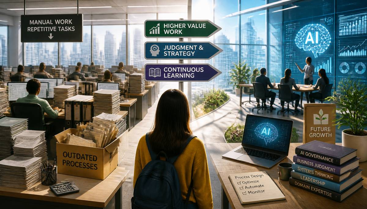 Companies are trimming payrolls and feeding the money into artificial intelligence, and the math is changing faster than the weather on a bad coast. Across technology, finance, and other fields, management is flattening org charts, chasing efficiency, and putting capital into AI systems instead of more hires.
Anant Kale, co-founder and CEO of AppZen, an AI-focused finance company, sees no miracle fix in simply handing every worker a new tool. Some roles get sharper with AI. Some become far more productive. Some disappear in the shape they used to wear. In finance especially, AI agents are taking on process-heavy work once done by large operations staffs, pushing people toward work that carries more judgment and more value.
That shift leaves a bruise on the talent pipeline. Entry-level jobs long served as the back room where people learned the trade. If AI takes the repetitive chores, companies will need new ways to train beginners. The upside is that newcomers can spend less time grinding through transactions and more time learning outcomes, decisions, and strategy.
Kale argues that the durable edge is not prompt tricks but knowing how work actually moves. The workers who stay valuable will understand process design and optimization, AI governance and oversight, and business judgment. Technical AI skills will age. Systems thinking, domain expertise, leadership, problem-solving, and the ability to keep learning likely will not.
Posted on 7 June 2026
Auto Industry Swerves From Certainty to Catch-All Strategy
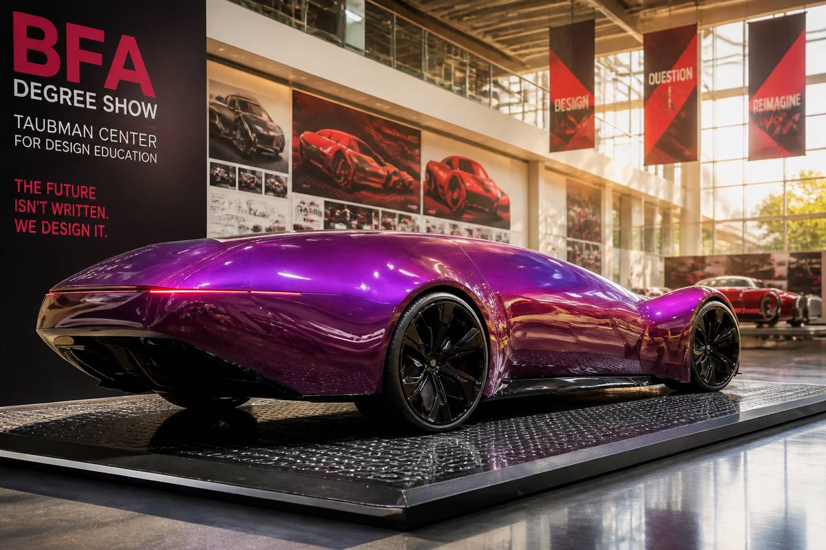 At the A. Alfred Taubman Center for Design Education, the BFA Degree Show opened on May 15th with a brisk, bright-eyed sense that the car world has driven into fog rather than sunrise.
Jason White, assistant professor at CCS, highlights a group of standout projects against a wider industry mood that has shifted sharply. For years, the route ahead looked almost diagrammatic: electric vehicles would sweep through new-car sales, old marques would emerge reborn in glossy, radical forms, and the public would clap politely while charging. That script has not unfolded.
Instead, the global automotive business is confronting a stubborn mismatch between aspiration and appetite. Manufacturers made large, confident plans for an EV-led future, but the market has answered with hesitation. Buyers, by and large, have not committed themselves fully to the version of tomorrow presented to them.
White frames this moment through a line from Terminator 2: Judgment Day, spoken by Sarah Connor, describing the future as a black highway at night and history being invented on the move. It fits. The certainty has drained away; the map is less map, more smudge.
For now, the industry response is practical rather than prophetic: keep the buffet open. In other words, major automakers are trying to serve every sort of customer at once.
Posted on 6 June 2026
Audi’s Nuvolari Is a Hybrid Supercar Meant to Drag the Brand Into Its Next Design Era
 Audi has wheeled out the Nuvolari, the second big marker of Massimo Frascella’s influence since he arrived as chief design officer in June 2024. If the earlier Concept C was the manifesto, this is the loud, expensive punctuation mark at the end of the sentence: a monolithic supercar built to broadcast the brand’s new Radical Next design language from the top of the range downward.
Like the well-received Concept C, the Nuvolari was developed in-house and carries the same stripped-back, rationally minimalist attitude. But where the Concept C points to a purely electric future, the Nuvolari takes a more theatrical route. Its drivetrain pairs a twin-turbocharged 4.0-litre V8 with three axial-flux electric motors in a plug-in hybrid setup, suggesting Audi still sees value in mixing voltage with violence when it wants to stir enthusiasts.
The timing is telling. Order books are due to open in late 2026, with first deliveries scheduled for 2027. That puts the Nuvolari into customers’ hands before the production version of the Concept C, despite the latter’s role as the cleaner, EV-led vision.
This is more than a halo car. Audi is using it as a battering ram: to reinforce emotional attachment to the brand, reset expectations around its design direction, and make Frascella’s second statement impossible to ignore.
Posted on 5 June 2026
Ugly Buildings, Elevated Cortisol
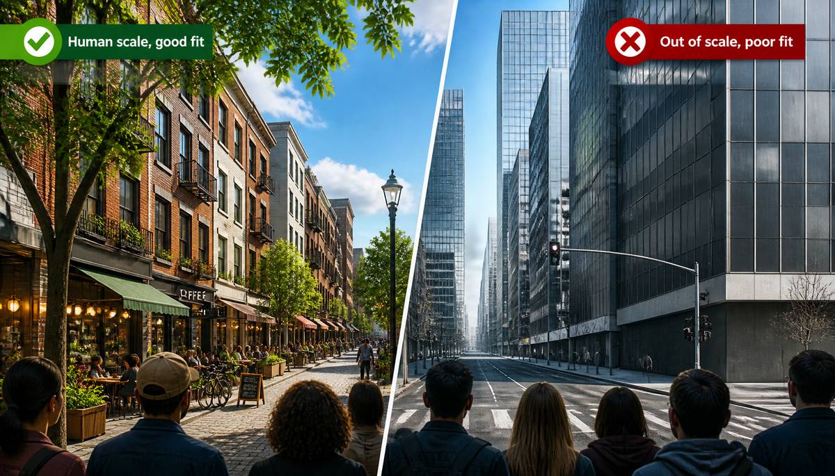 Housing fights are often staged as spreadsheets versus sympathy, but the nervous system keeps sneaking into the room. Research from David Broockman, Chris Elmendorf, and Joshua Kalla finds that resistance to new housing is strongly shaped by whether buildings look harsh, awkward, or out of place. People are not only reacting to who might live there; they are reacting to what they must look at.
Environmental psychology and neuroscience help explain why. Streets with trees, steady building heights, and three- to five-story forms tend to feel legible and sheltered. That prospect-and-refuge balance lowers stress markers, including heart rate and cortisol. Green views even correlate with faster hospital recovery. By contrast, visual disorder, blank glass or metal facades, and jagged forms can keep people subtly on edge. Humans seem to prefer rhythm with variation: repeated windows, shopfronts, awnings, textured materials, rounded details, and the fractal richness common in nature. Slow streets matter too. Narrow lanes, pavers, outdoor seating, and active storefronts make people linger instead of flee.
A 2025 study by Adrian Pietrzak and Tali Mendelberg found that mismatched height draws more objection than height alone. A taller building that belongs can fare better than a shorter one that doesn’t. In Los Angeles, the Livable Communities Initiative says five years of outreach found near-universal support for housing when it is human-scale, well-designed, and paired with walkable streets. Support collapsed by 90% to 95% for low-quality, out-of-scale projects.
Posted on 4 June 2026
Ferrari’s Electric Debut Runs Cold
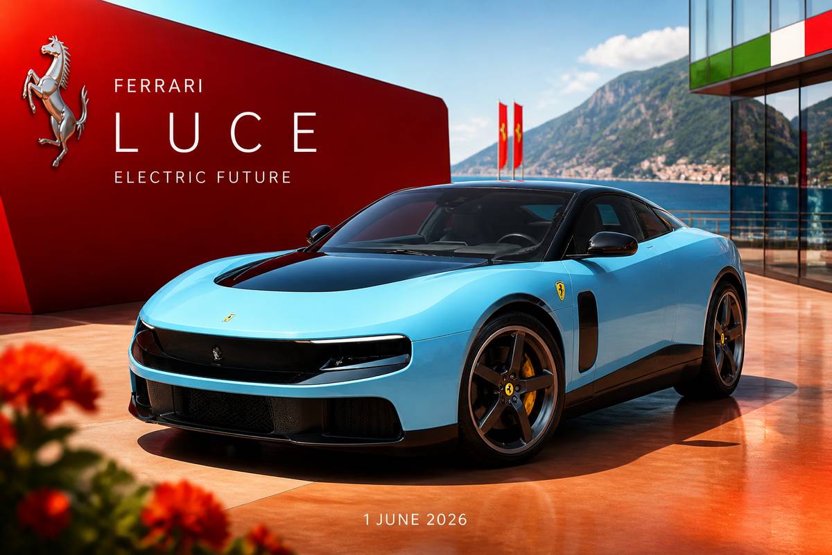 Ferrari finally brought its electric future into the open on 1 June 2026, and the result landed like a champagne coupe dropped on a marble floor. The Luce is a striking thing to look at, sure enough, but it doesn’t convince as a Ferrari. It feels less like an object of longing than a carefully resolved consumer product, and that is where the trouble starts.
For years, mainstream attention rarely found car designers unless something had gone badly sideways. Jaguar’s recent rebrand was one example, swallowing the car beneath the noise. Ferrari has managed a rarer feat: the product itself has taken the hit. The Luce has drawn a wave of disbelief and disgust that cuts across the usual fault lines of taste.
Part of that was always coming. An electric Ferrari was bound to offend traditionalists. Enzo Ferrari built the marque on the primacy of the engine, treating the car around it as secondary. He also insisted the best Ferrari was always the next one. Those two ideas now collide head-on in the Luce.
LoveFrom’s contribution to the Ferrari story is fascinating as industrial design. As brand expression, it is another matter. The car may point toward Maranello’s future, but it arrives stripped of the emotional voltage that made the badge matter in the first place.
Posted on 2 June 2026
Anthropic Wants Claude to Be Your Design Department’s Fastest Intern
 Anthropic Labs has unveiled Claude Design, a research-preview tool released on Apr 17, 2026 that turns Claude into a brisk, slightly unnerving creative accomplice. Built on Claude Opus 4.7, the company’s strongest vision model, it is rolling out gradually to Claude Pro, Max, Team, and Enterprise users.
The premise is simple and rather intoxicating: ask for a visual thing and get a usable first draft, whether that’s a prototype, slide deck, one-pager, mockup, landing page, campaign asset, or something more experimental involving voice, video, shaders, 3D, and embedded AI.
For designers, it promises more room to try wildly different directions without burning days on each one. For founders, marketers, and product managers, it lowers the terrifying blank-page moment. Edits can happen through chat, direct text changes, inline comments, or Claude-made sliders for layout, spacing, and colour.
A notable trick is automatic brand alignment. During setup, Claude Design reads a team’s codebase and design files to assemble a design system, then applies the right colours, type, and components across future projects. It can also import prompts, images, DOCX, PPTX, XLSX files, website captures, and codebases.
Teams can share work across an organisation, export to Canva, PDF, PPTX, HTML, or pass a handoff bundle straight to Claude Code. More integrations are promised in the coming weeks.
Posted on 1 June 2026
Meta Pins Its Hopes on an AI Pendant
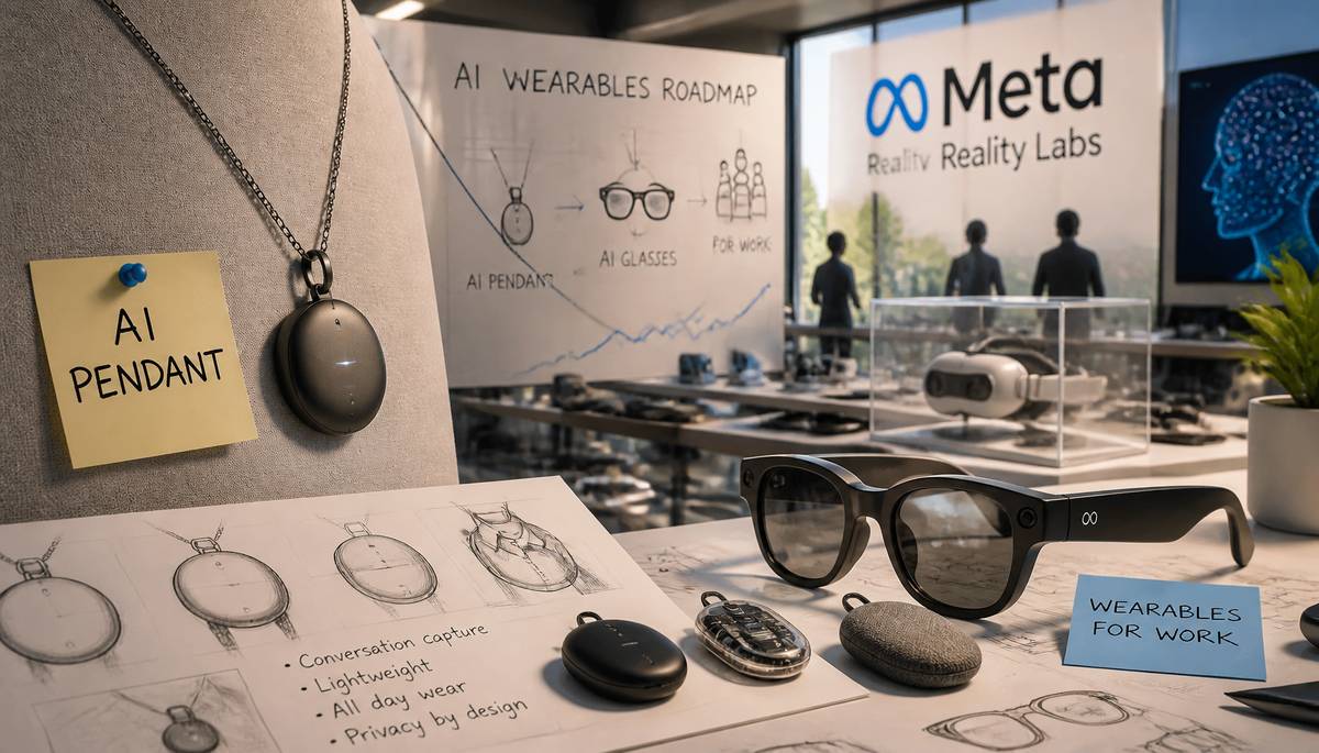 Meta is said to be preparing another wearable: an AI pendant slated for testing within the next year. The plan appears in an internal memo and suggests the company is still determined to find a gadget people will actually clip on willingly.
The pendant would likely draw on technology from Limitless, the AI-device startup Meta bought at the end of 2025. Limitless made a small wearable users could pin to a shirt or hang on a chain, with the purpose of recording conversations. Meta described that acquisition as a way to speed up its push into AI-enabled wearables.
There is, of course, a mild whiff of history repeating itself. Earlier AI wearables have largely failed to charm the public, whether because people were uneasy about privacy, put off by clumsy promotion, or simply unconvinced they needed one more thing listening near their collarbone. Even so, rivals including OpenAI continue to pursue the category.
The same memo indicates Meta wants to broaden its range of AI glasses and introduce a business offering called Wearables for Work. Taken together, the projects look like an attempt to improve the fortunes of Reality Labs, Meta’s hardware arm, which posted a $4 billion loss in the first quarter of this year.
Posted on 31 May 2026
A Labyrinth Built from Bad Carpets and Better Precision
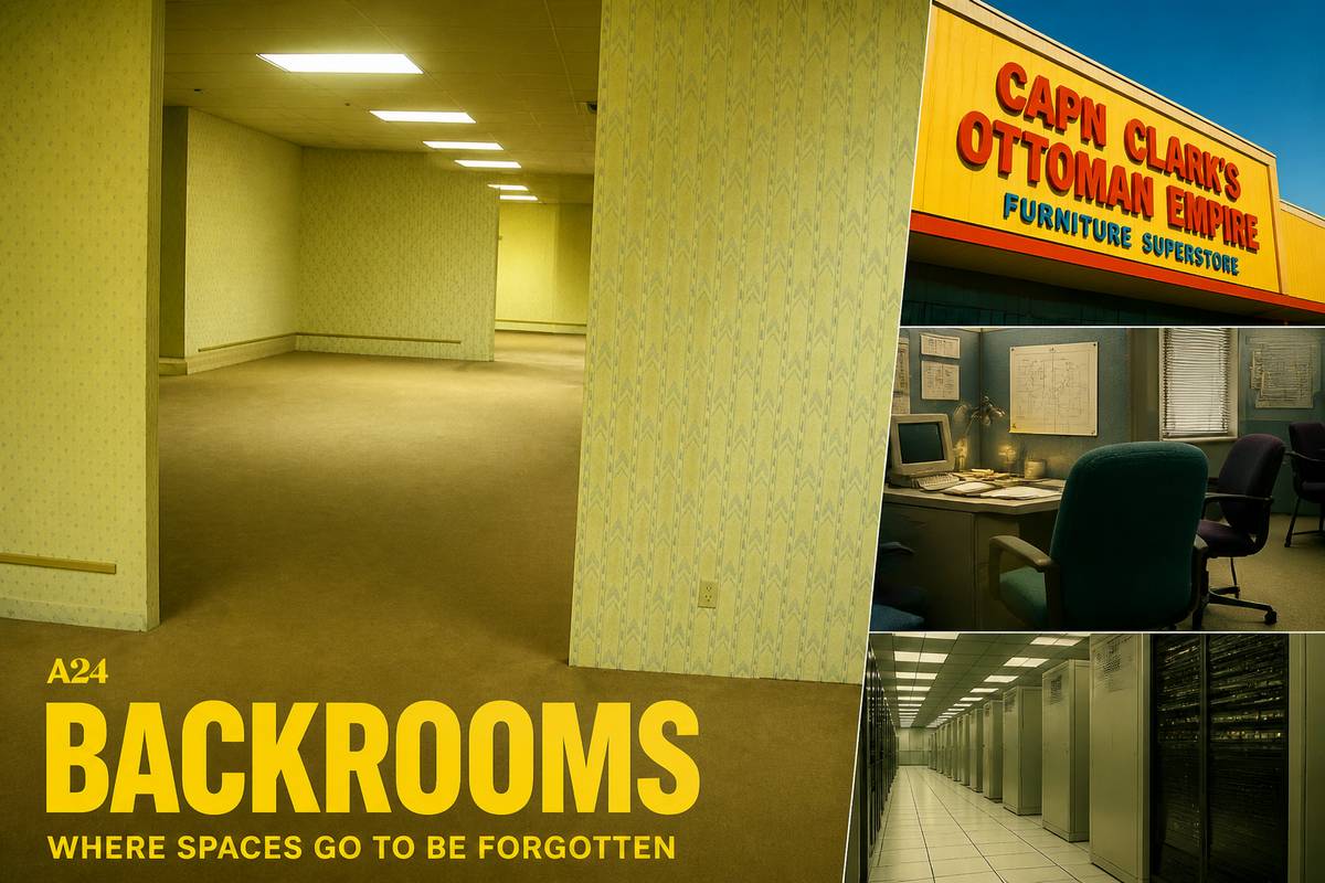 A24’s Backrooms takes an internet curiosity—a yellow, deserted room that became a creepypasta fixture in 2019—and enlarges it into a feature about Clark, played by Chiwetel Ejiofor, an architect diminished into the management of a big-box furniture mart called Capn Clarks Ottoman Empire. He passes through a wall and into Kane Parsons’s unnerving maze of liminal interiors: beige carpet, fluorescent glare, drop ceilings, corridors without purpose, and rooms behaving badly.
Production designer Danny Vermette built much of this world physically, though Parsons first devised it in Blender, the same software he used as a 16-year-old making the original shorts. His initial file was so vast it crashed Vermette’s computer, and the team had to choose carefully what to construct. They ultimately spread 30,000 square feet of set across four sound stages, reserving practical builds for spaces demanding bodily discomfort or vertical strain: 20-foot risers, sloped floors, narrow crevasses, tunnels, doors absurdly high on walls.
The horror depends as much on design failure as on emptiness. Vermette linked liminal unease partly to the careless volume-driven spaces of the 1970s through 1990s. To match the shorts, the crew tested 30 wallpaper-carpet pairings and multiple lighting schemes. Outside the backrooms, unease persists: Async echoes drab 90s data centres, Mary Kline’s office and the Ottoman Empire revel in aggressively unaesthetic 1990s fabrics and furniture. Vancouver architects may even spot technical drawings in Clark’s office borrowed from Vermette’s architect father-in-law.
Posted on 30 May 2026
When a Session Expires, Access Can Vanish
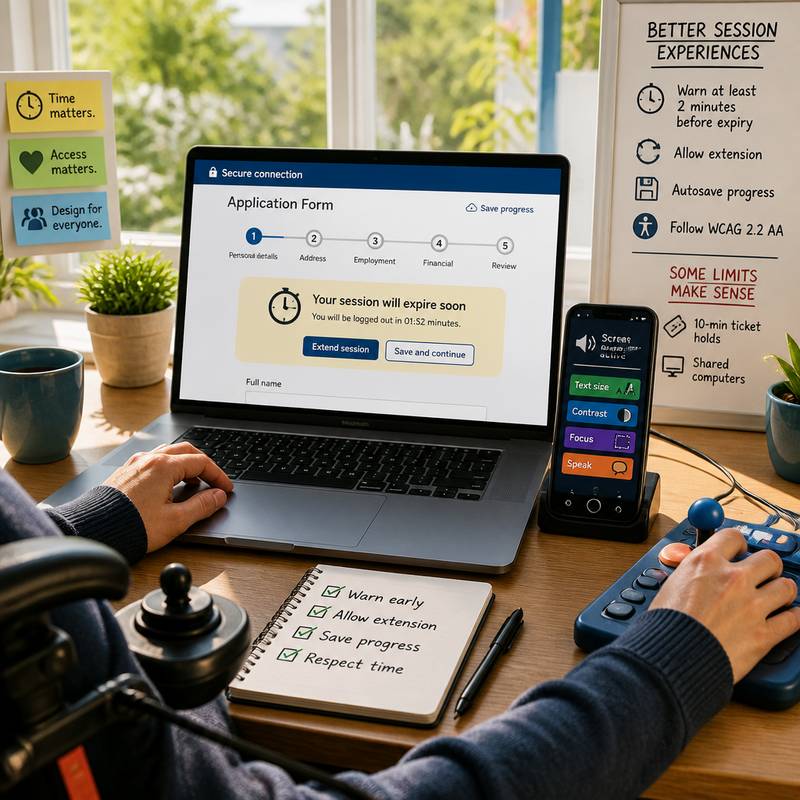 On the modern web, session timeouts are often treated as a small engine-room matter of security. In practice, they can bar the door to essential services. For many of the 1.3 billion people worldwide with significant disabilities, being logged out mid-task can mean a lost ticket, a missed appointment, or a ruined loan application.
The burden falls unevenly. Motor impairments such as cerebral palsy can slow input; the DWP Accessibility Manual notes adaptive technology may need repeated attempts to register actions. Cognitive differences matter too: about 20% of people are neurodivergent, and conditions including ADHD, dyslexia, autism, Down syndrome, dementia, and traumatic brain injury can make rigid timers hostile, especially for those with time blindness. Vision loss adds further delay: more than 43 million people are blind and 295 million have moderate to severe visual impairment, so screen-reader navigation simply takes longer. Bogdan Cerovac’s experience showed how a one-second countdown can flood assistive tech and make a page unusable.
Common failures are silent expiry, warnings that come too late, nonextendable sessions, and erased form data. The DS-260 visa form logs users out after roughly 20 minutes idle, saves only on page completion, and offers only an approximate estimate. Better practice exists: the U.K. pension credit application warns at least two minutes before expiry and allows extension, aligning with WCAG 2.2 AA. Activity-based limits are often harsher than clear absolute ones. Autosave through cookies, localStorage, or sessionStorage can preserve work across reauthentication. Some limits remain justified, such as 10-minute ticket holds or shared computers, while untimed reading or shopping rarely needs forced expiry. With 62% of adults with disabilities owning a computer and 72% having high-speed home internet, accessible session design is not edge work but basic respect. Posted on 28 May 2026
designerlistings.org (c)2009 - 2026